
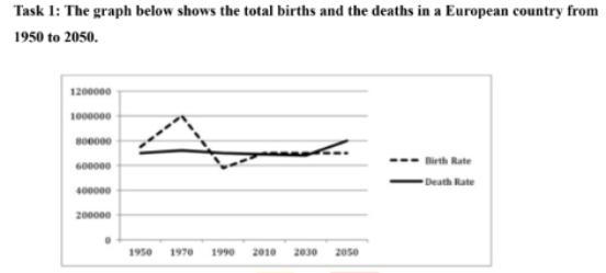
The line charts illustrate the number of births and deaths in European areas between 1950 and 2050. Overall, the number of births significantly fluctuates but it does not change throughout the period. Compared to birth, deaths remain unchanged over the period and slightly rise at the end of the period. In 1950, births were relatively high at approximately around 750,000, compared to around 700,000 deaths. Over the next decade, births had significant changes and reached a peak at 1 million in 1970. At the same period, death rose only slightly around 700,000. Between 1970 and 2010, births sharply decreased and reached a lowest point at 600,000 in 1990, and recovered modestly at nearly 700,000 in 2010. Then they have relatively remained stable, with a slight decrease toward 2050. In contrast, deaths remain fairly constant at about 700,000 between 1990 and 2010, before increasing steadily to around 800,000 by 2050.
Detail Sampel
The graph below shows the total births and the deaths in a European country from1950 to 2050
18/07/2026 09:26 6.5 skor
Topik
The graph below shows the total births and the deaths in a European country from1950 to 2050
Jumlah kata: 149
Grafik/Diagram
Essay
Skor Keseluruhan
6.5±0.5
Cukup
Skor Kriteria Writing
TA6.0
CC7.0
LR7.0
GRA7.0
Task Achievement6.0
Target: 7.0
Kesalahan:1
Coherence & Cohesion7.0
Target: 7.0
Kesalahan:3
Lexical Resource7.0
Target: 7.0
Kesalahan:4
Grammar & Accuracy7.0
Target: 7.0
Kesalahan:0
Klik teks yang ditandai di esai untuk melihat saran detail untuk peningkatan.
Analisis mendalam
Task 1 - Academic Writing
4 tools available
Esai contoh - IELTS Writing Task 1
Belum ada esai contoh
Silakan klik tombol di bawah untuk menganalisis dan membuat esai contoh berkualitas tinggi untuk Task 1.