
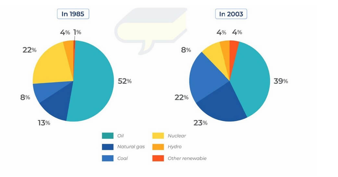
The pie chart illustrates the changes in the proportion of energy produced from different resources in the country from 1985 to 2003. Overall, it is evident that despite these changes, oil resources maintained its leading position over the period, whereas other renewable resources recorded a slight increase. Regarding the two resources with the highest percentage of producing energy, oil resources had the largest proportion throughout the period despite this figure declining from 52% to 39% in this period. By contrast, the figure for natural gas recourse rose considerably by 10% between 1985 and 2003. Turning to the remaining categories, the percentage of natural gas experienced an increase trend, rising from 8% to 22% from 1985 to 2003, while the figure for nuclear resources witnessed a decrease significantly from 22% to 8%. Moreover, the figure for hydro resources remained unchanged over the period, compared with rising by 3% for the proportion of other renewable resources.
Sample Detail
The charts below show changes in the proportion of energy produced from different resources in the country in 1985 and 2003.
18/07/2026 09:51 6.5 points
Topic
The charts below show changes in the proportion of energy produced from different resources in the country in 1985 and 2003.
Word count: 154
Chart/Graph
Essay
Overall Scores
6.5±0.5
Fair
Writing Criteria Scores
TA6.0
CC7.0
LR6.0
GRA7.0
Task Achievement6.0
Target: 7.0
Errors:2
Coherence & Cohesion7.0
Target: 7.0
Errors:2
Lexical Resource6.0
Target: 7.0
Errors:3
Grammar & Accuracy7.0
Target: 7.0
Errors:0
Click on any highlighted text in the essay to view detailed suggestions for improvement.
Deep Analysis
Task 1 - Academic Writing
4 tools available
Sample Essay - IELTS Writing Task 1
No sample essay
Click the button below to analyze and generate a high-quality sample essay for Task 1.