
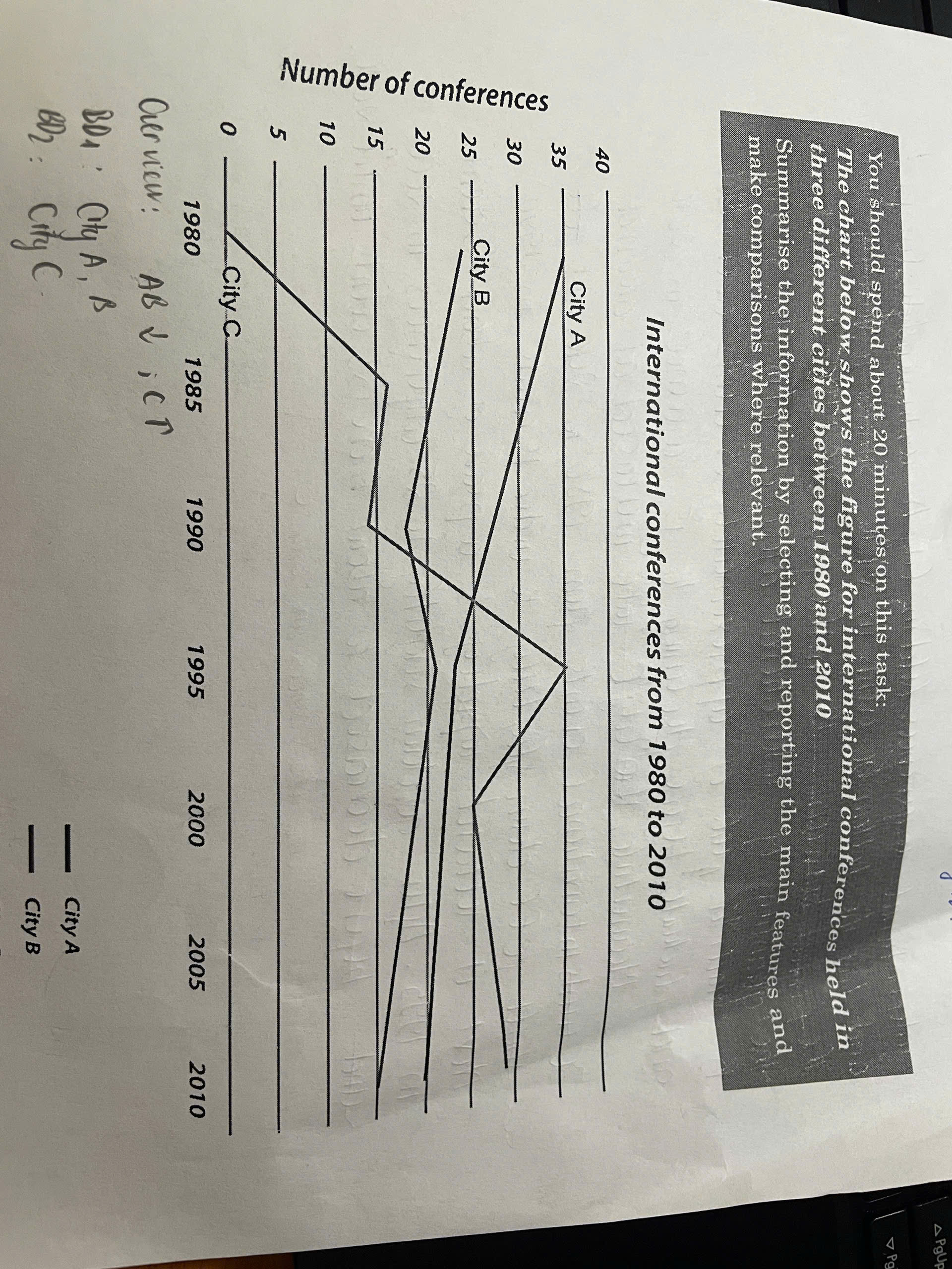
The line chart illustrates about the number of conferences hosted in three different cities over 30-year period. starting from 1980 to 2010. Overall, it can be seen that while the number of conferences at city A and city B declined, the opposite was true for city C, over the period shown. In 1980, the number of conferences in city A, which stood at 35 events, was the highest among the three cities in the same time. During the period between 1980 and 2010, the figure for international conferences held in city a continuously slumped and hut the bottom of 20 events in 2010. Similarly, from 1980 to 2010, the quantity of international conferences taking place in city B, reached a peak of approximately 25 events in 1980. and fluctuated before declining to 15 conferences in 2010. Mean while, the figure in city C increased at around 30 international events from 1980 to 2010. It fell down slightly to under 15 events in 1990. Next it rocketed to a peak about 35 events in 1995. After going down slightly to 25 conferences in 2000, the number of global conferences in city C decreased to about more than 25 events in 2010.
รายละเอียดตัวอย่าง
The chart below shows the figure for international conferences held in three different cities between 1980 and 2010
18/07/2026 15:03 5.0 คะแนน
หัวข้อ
The chart below shows the figure for international conferences held in three different cities between 1980 and 2010
จำนวนคำ: 200
แผนภูมิ/กราฟ
Essay
คะแนนรวม
5.0±0.5
พื้นฐาน
คะแนนเกณฑ์การเขียน
TA5.0
CC6.0
LR5.0
GRA5.0
Task Achievement5.0
เป้าหมาย: 7.0
ข้อผิดพลาด:1
Coherence & Cohesion6.0
เป้าหมาย: 7.0
ข้อผิดพลาด:3
Lexical Resource5.0
เป้าหมาย: 7.0
ข้อผิดพลาด:5
Grammar & Accuracy5.0
เป้าหมาย: 7.0
ข้อผิดพลาด:0
คลิกข้อความที่ไฮไลต์ในเรียงความเพื่อดูคำแนะนำรายละเอียดเพื่อพัฒนา
การวิเคราะห์เชิงลึก
Task 1 - Academic Writing
4 tools available
บทความตัวอย่าง - IELTS Writing Task 1
ยังไม่มีบทความตัวอย่าง
กดปุ่มด้านล่างเพื่อวิเคราะห์และสร้างบทความตัวอย่างคุณภาพสูงสำหรับ Task 1