
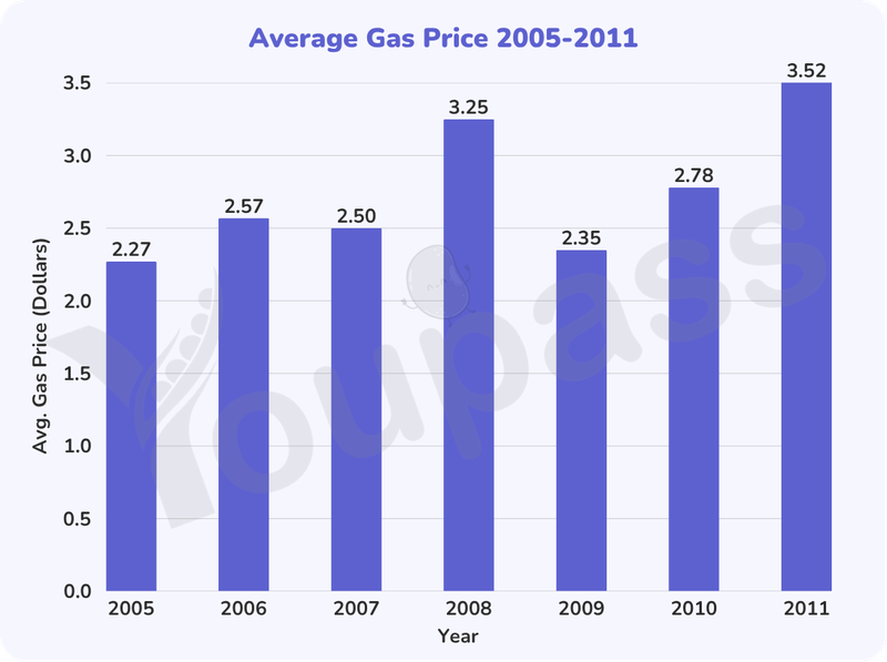
the given bar chart illutrates the a mount of gas prise in two states in the USA over the period of six years. Overall, it is clear that there was a increase in the amount of the price in all of period, the downward trend was seen in the statistics for 2009. In addition, the figures for gas price in 2011 had highest, and the cost of fuel had lowest throughout the period . At first, the amount of gas price in 2005 started at 2,27 dollars , after that it experienced an increase slightly to 2,57 dollars in 2006. In contrast, the fuel's cost in 2007 was about 2,50 dollars, with a subsiquent dramatic rised to 3,25 in 2008. The opposite trend can be seen in the igures for the cost of fuel, starting at 2,35 dollars in 2009, the a mount of this rised to 2,78 dollars in 2010, followed by a final reaching a peak of 3,52 dollars in 2011.
รายละเอียดตัวอย่าง
The bar chart shows the price of fuel in two states in the USA from 2005 to 2011. Summarise the information by selecting and reporting the main features, and make comparisons where relevant.
18/07/2026 15:23 5.0 คะแนน
หัวข้อ
The bar chart shows the price of fuel in two states in the USA from 2005 to 2011. Summarise the information by selecting and reporting the main features, and make comparisons where relevant.
จำนวนคำ: 163
แผนภูมิ/กราฟ
Essay
คะแนนรวม
5.0±0.5
พื้นฐาน
คะแนนเกณฑ์การเขียน
TA5.0
CC6.0
LR5.0
GRA5.0
Task Achievement5.0
เป้าหมาย: 7.0
ข้อผิดพลาด:0
Coherence & Cohesion6.0
เป้าหมาย: 7.0
ข้อผิดพลาด:5
Lexical Resource5.0
เป้าหมาย: 7.0
ข้อผิดพลาด:2
Grammar & Accuracy5.0
เป้าหมาย: 7.0
ข้อผิดพลาด:0
คลิกข้อความที่ไฮไลต์ในเรียงความเพื่อดูคำแนะนำรายละเอียดเพื่อพัฒนา
การวิเคราะห์เชิงลึก
Task 1 - Academic Writing
4 tools available
บทความตัวอย่าง - IELTS Writing Task 1
ยังไม่มีบทความตัวอย่าง
กดปุ่มด้านล่างเพื่อวิเคราะห์และสร้างบทความตัวอย่างคุณภาพสูงสำหรับ Task 1