
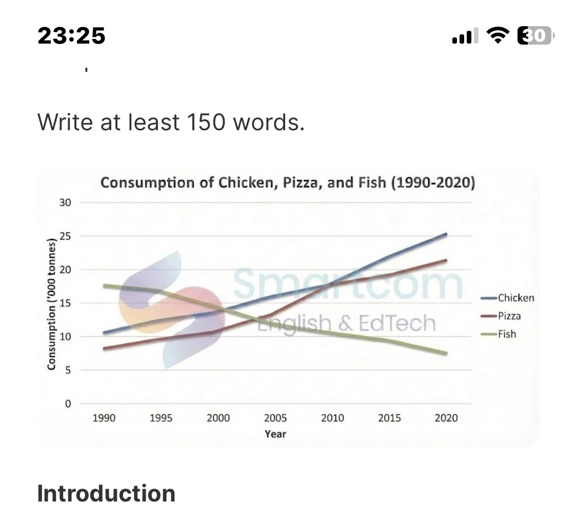
The line graph gives information about the number of Chicken, Pizza, and Fish consumed over a 30-years of period from 1990 to 2020. Initially, It can be seen a clear upward trend is discernible for both chicken and pizza eaten while the consumption of fish showed a downward trend and became the least preferrable figure at the end of the period. In 1990, the figure for fish was the highest, accounting for 18 before decreasing to 8 in 2020. Meanwhile, The number of Chicken eaten starting at around 10. However, in the next year, there was a remarkable rise in the consumption of chicken eaten at 25 which was the highest among three categories in 2020. Furthermore in 1990, At the lowest point was the consumption of pizza at approximately 7. After that, this figure witnessed a steady growth and intersected with chicken consumption at 18 in 2010. Then, it continued going up slightly which ended at 23.
Sample Detail
The line graph below shows the amount of chicken, pizza, and fish consumed in a particular country from 1990 to 2020. Summarize the information by selecting and reporting the main features, and make comparisons where relevant. Write at least 150 words.
18/07/2026 17:05 5.5 points
Topic
The line graph below shows the amount of chicken, pizza, and fish consumed in a particular country from 1990 to 2020. Summarize the information by selecting and reporting the main features, and make comparisons where relevant. Write at least 150 words.
Word count: 158
Chart/Graph
Essay
Overall Scores
5.5±0.5
Basic
Writing Criteria Scores
TA6.0
CC6.0
LR5.0
GRA5.0
Task Achievement6.0
Target: 7.0
Errors:0
Coherence & Cohesion6.0
Target: 7.0
Errors:3
Lexical Resource5.0
Target: 7.0
Errors:4
Grammar & Accuracy5.0
Target: 7.0
Errors:0
Click on any highlighted text in the essay to view detailed suggestions for improvement.
Deep Analysis
Task 1 - Academic Writing
4 tools available
Sample Essay - IELTS Writing Task 1
No sample essay
Click the button below to analyze and generate a high-quality sample essay for Task 1.