
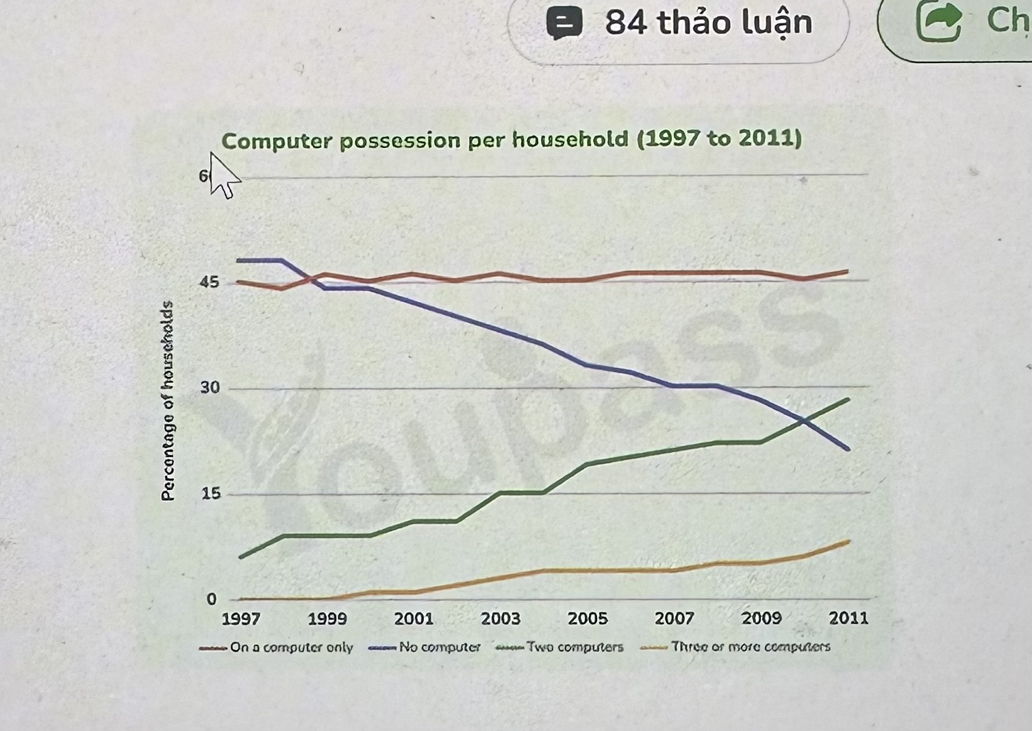
The line chart illustrates the proportion of households owned different number of computers between 1997 and 2011. It is clear from the line chart that all the figures experienced a noticeable change during the research period. At the same time, while No computer saw a downward trend, the opposing case was true for Two computers and Three or more computers. Moving to a more detailed analysis, Two computers stood at 6% in 1997, which was followed by a dramatic growth at 28% from 1997 to 2011. Likewise, the figure for Three or more computers rose gradually from 0% to 9% by the end of period. Following that, the proportion of households with No computers stood at the highest level in 1997, at nearly 50%, before declining sharply to around 22% from 1997 to 2011. By contrast, the figure for On a computer only experienced a slight increase, but later fluctuated at around 46% over the period.
Sample Detail
The graph below gives information about computer possession by household in one European country between 1997 and 2011. Summarise the information by selecting and reporting the main features, and make comparisons where relevant.
18/07/2026 23:13 7.0 points
Topic
The graph below gives information about computer possession by household in one European country between 1997 and 2011. Summarise the information by selecting and reporting the main features, and make comparisons where relevant.
Word count: 156
Chart/Graph
Essay
Overall Scores
7.0±0.5
Good
Writing Criteria Scores
TA7.0
CC7.0
LR7.0
GRA7.0
Task Achievement7.0
Target: 7.0
Errors:0
Coherence & Cohesion7.0
Target: 7.0
Errors:2
Lexical Resource7.0
Target: 7.0
Errors:2
Grammar & Accuracy7.0
Target: 7.0
Errors:0
Click on any highlighted text in the essay to view detailed suggestions for improvement.
Deep Analysis
Task 1 - Academic Writing
4 tools available
Sample Essay - IELTS Writing Task 1
No sample essay
Click the button below to analyze and generate a high-quality sample essay for Task 1.