
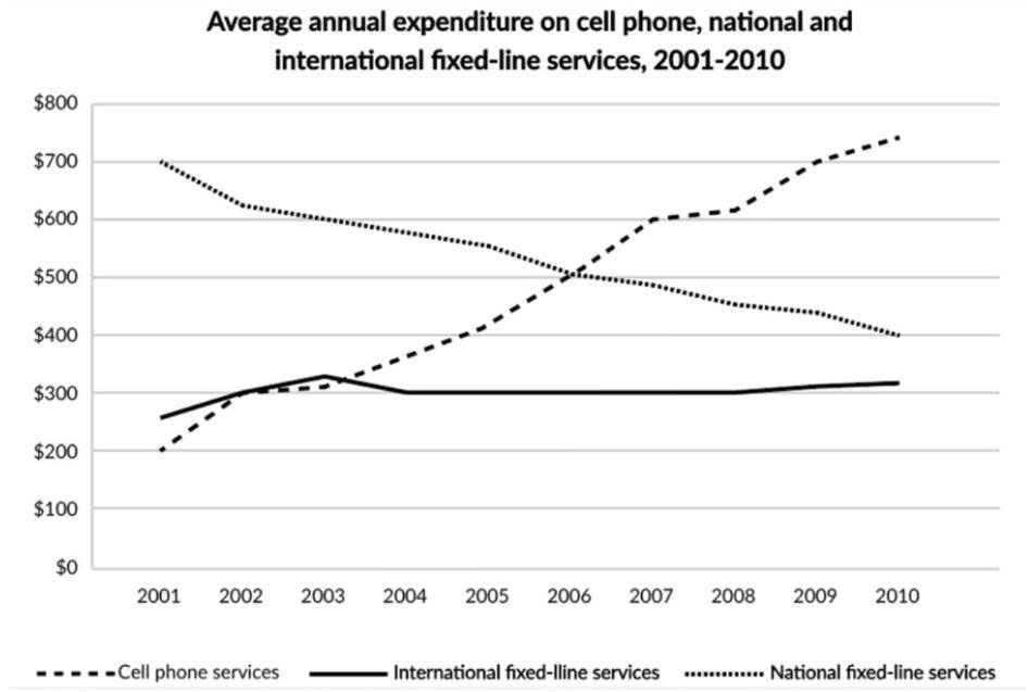
The line graph depicts the proportion of people spending money using three different devices ( cell phone services, international fixed-line and national fixed-line services) from 2001 to 2010. Overall, it is clear that the average annual spending on national fixed-line services witnessed a downward trend, while the opposite was true for international fixed- line services. Additionally, cell phone services recorded the highest expenditure at the end of the period. Spending on national fixed-line services showed the highest consumption of about $700 in 2001 and decreased slowly to about $500 in 2006, continuing to decrease to about $400 in 2010. Next, spending on International fixed-line services consumed a peak at about $280 in 2001, increasing significantly to about $320 in 2003 and after leveling off until 2010. In contrast, pending on cell phone services started at about $200 in 2001, then its growth was dramatic to about $500 in 2006 and continued , ending at around $700 in 2010, becoming the highest figure.
Detail Sampel
The graph below shows consumers’ average annual expenditure on cell phone, national and international fixed-line and services in America between 2001 and 2010.
19/07/2026 05:25 6.0 skor
Topik
The graph below shows consumers’ average annual expenditure on cell phone, national and international fixed-line and services in America between 2001 and 2010.
Jumlah kata: 162
Grafik/Diagram
Essay
Skor Keseluruhan
6.0±0.5
Cukup
Skor Kriteria Writing
TA6.0
CC7.0
LR6.0
GRA6.0
Task Achievement6.0
Target: 7.0
Kesalahan:1
Coherence & Cohesion7.0
Target: 7.0
Kesalahan:2
Lexical Resource6.0
Target: 7.0
Kesalahan:3
Grammar & Accuracy6.0
Target: 7.0
Kesalahan:0
Klik teks yang ditandai di esai untuk melihat saran detail untuk peningkatan.
Analisis mendalam
Task 1 - Academic Writing
4 tools available
Esai contoh - IELTS Writing Task 1
Belum ada esai contoh
Silakan klik tombol di bawah untuk menganalisis dan membuat esai contoh berkualitas tinggi untuk Task 1.