
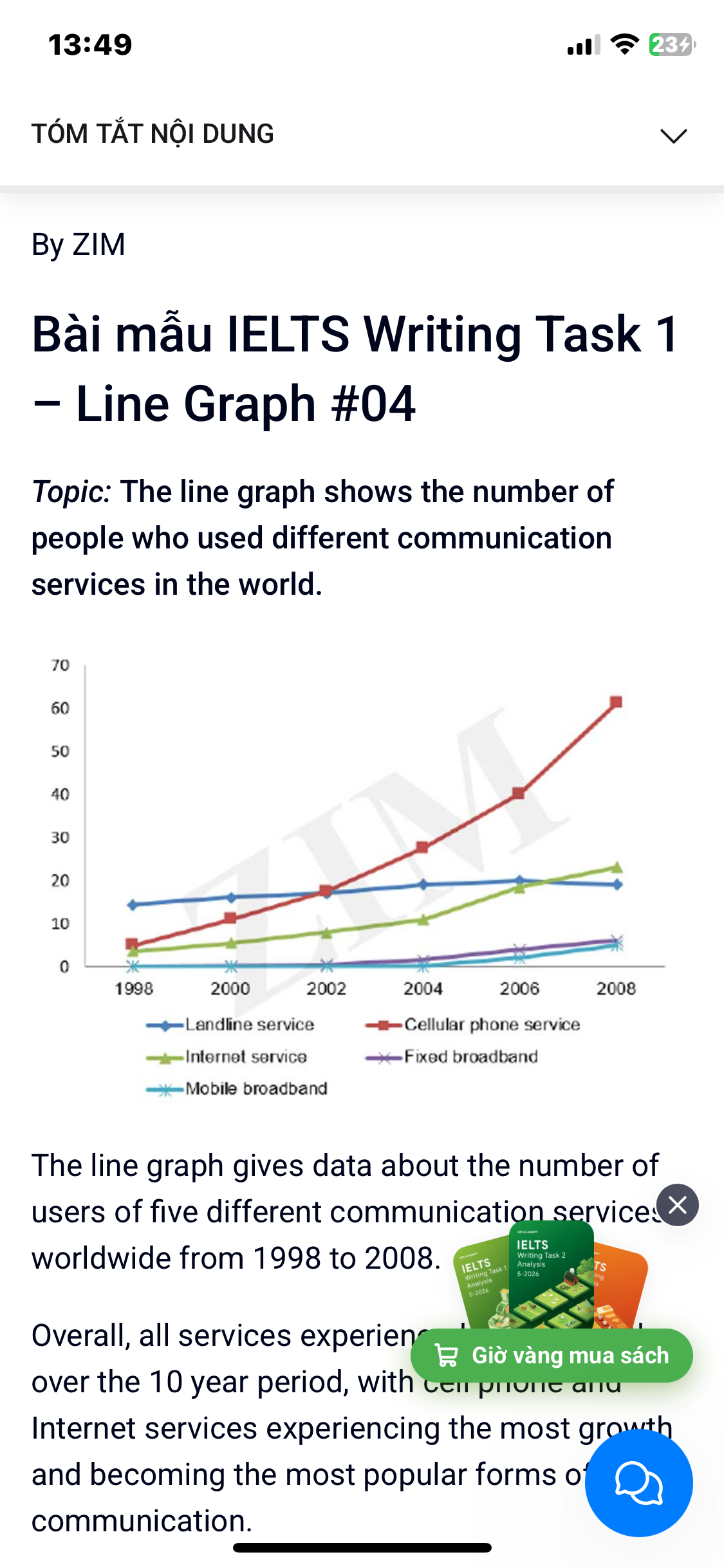
The line chart demonstrates how many people using five distinct communication services in the world over a ten-year period. As can be seen, the number of people who used landline service remaining stable over the decade. Meanwhile, this figure for four others witnessed an upward trend. Additionally, cellular phone service showed the most significant climb over the decade. Initially, the number of people choosing landline service almost unchanged which was started at 15. Then, it grew slightly and peaked at nearly 20 in 2006 before falling to 15 at the end. Furthermore, cellular phone service began at only 5 in 1998. However, it recorded a remarkable surge over the years and reached at around 60 in 2008, overtaking landline service to become the most popular service. Moreover, 3 was the number of people who used internet service in 1998. In the following years, it saw a dramatical increase, surpassing landline service in 2007 and reached at more than 20 in 2008. In addition, from 1998 to 2002, mobile broadband intersected with fixed broadband at 0. After this years, they experienced a slow rise with the former growing from 0 to 6, the latter increasing from 0 to 5 at the end.
Detail Sampel
The line graph shows the number of people who used different communication services in the world.
19/07/2026 07:38 7.0 skor
Topik
The line graph shows the number of people who used different communication services in the world.
Jumlah kata: 201
Grafik/Diagram
Essay
Skor Keseluruhan
7.0±0.5
Baik
Skor Kriteria Writing
TA7.0
CC7.0
LR7.0
GRA7.0
Task Achievement7.0
Target: 7.0
Kesalahan:0
Coherence & Cohesion7.0
Target: 7.0
Kesalahan:1
Lexical Resource7.0
Target: 7.0
Kesalahan:2
Grammar & Accuracy7.0
Target: 7.0
Kesalahan:0
Klik teks yang ditandai di esai untuk melihat saran detail untuk peningkatan.
Analisis mendalam
Task 1 - Academic Writing
4 tools available
Esai contoh - IELTS Writing Task 1
Belum ada esai contoh
Silakan klik tombol di bawah untuk menganalisis dan membuat esai contoh berkualitas tinggi untuk Task 1.