
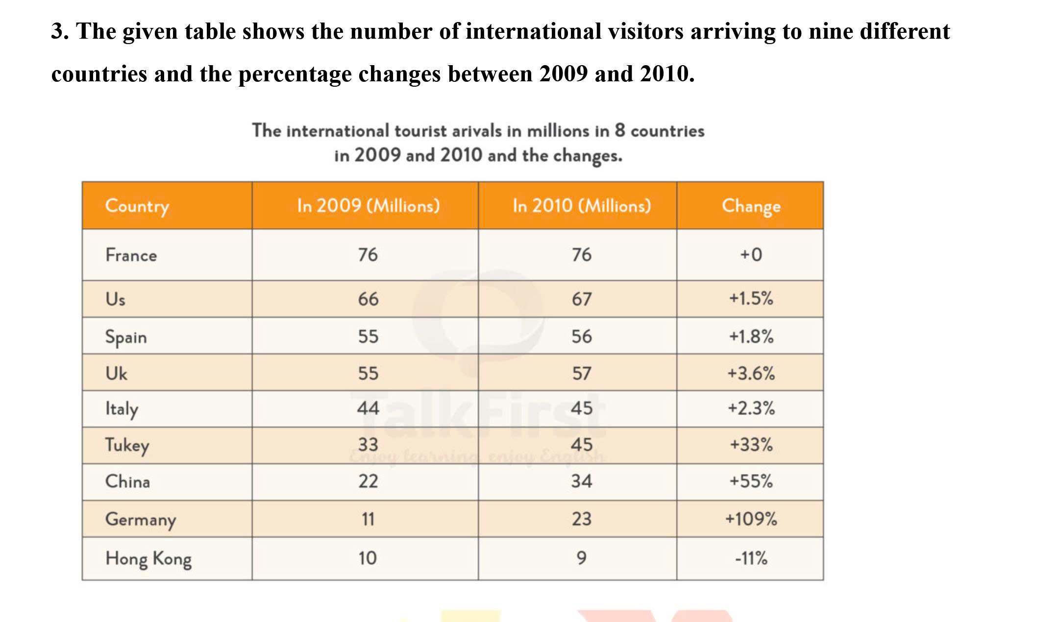
The table illustrates the number of global visitors traveling to nine different countries and compares changes in percentage between 2009 and 2010. Overall, what is most striking when looking at the chart is that while experiencing no changes in percentage, the number of people visiting France took the lead in both 2009 and 2010, which contrasted with Hong Kong that hit a nadir in both years. Another noticeable point is that almost all of the given countries witnessed an increase between the aforementioned years, except for France that showed no changes, and Hokong that experienced significant decline. In 2009, around 76 million people visited France, making it the highest number recorded on the table. Despite remaining stable until 2010, no other countries could surpass France in terms of visitors. Following this, the number of US visitors stood at 66 million in 2010, and rose to 67 million, thus showing a 1,5% increase. A similar starting point can be seen in Spain and the UK in 2009 with 55 million travelers to the regions. However, as Spain rose to 56 million and the UK climbed to 57 million, the percentage changes in the UK was double that of Spain, standing at 3.6% and 1.8% respectively. Notably, with 2.3% change in percentage, Italy climbed from 44 to 45 million visitors between two years. Regarding the remaining countries that had their initial points standing at 33 million and below, in 2009, around 33 million people visited Turkey, which was half that of the US in the same year. Notably, with a 33% increase, it increased significantly to 45 million in 2010. A much more significant change was seen in China, with 22 million travelers, half that of Italy in 2009, it rose swiftly to 34 million in the year later, marking a 55% increase. Germany and Hong Kong together had the same modest start compared to the others, standing at 11 million and 10 million respectively. However, a big contrast was seen in 2010, with Germany rising to 23 million, showing the highest percentage change ever recorded on the table, representing 109%, and Hong Kong had a 11% decrease, falling to 9 million.
Sample Detail
The table illustrates the number of global visitors traveling to nine different countries and compares changes in percentage between 2009 and 2010.
19/07/2026 07:38 7.0 points
Topic
The table illustrates the number of global visitors traveling to nine different countries and compares changes in percentage between 2009 and 2010.
Word count: 360
Chart/Graph
Essay
Overall Scores
7.0±0.5
Good
Writing Criteria Scores
TA7.0
CC7.0
LR7.0
GRA7.0
Task Achievement7.0
Target: 7.0
Errors:0
Coherence & Cohesion7.0
Target: 7.0
Errors:3
Lexical Resource7.0
Target: 7.0
Errors:4
Grammar & Accuracy7.0
Target: 7.0
Errors:0
Click on any highlighted text in the essay to view detailed suggestions for improvement.
Deep Analysis
Task 1 - Academic Writing
4 tools available
Sample Essay - IELTS Writing Task 1
No sample essay
Click the button below to analyze and generate a high-quality sample essay for Task 1.