
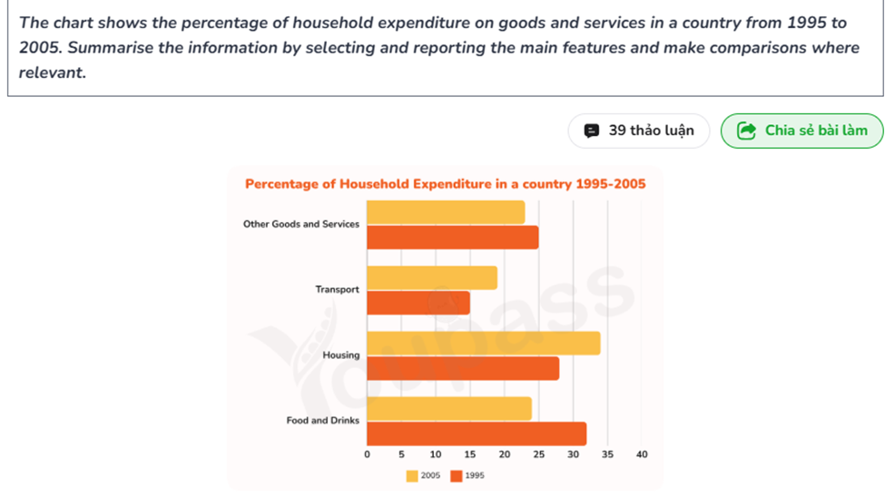
The bar graph illustrates the proportion of household expenditure on goods and services in a country from 1995 to 2005. Overall, the percentage of household spending on transport and housing followed an upward trend betwen 1995 and 2005 while those of food and drinks and other goods and services decreased over the period. Concerning the increasing categories, the rate of household expenditure on transport started at 15%, which was the leatest in the first decade before rising to roughly 18% in 2005. Similarly, housing usage in 1995 accounted for nearly 28% and translated to a approximately 34% growth by the end, which was the most important in this time. Regarding the remaining features, the proportion speding on food and drinks was the highest in 1995, and declined significantly with 24% in 2005. Finally, the percentage of expenditure on other goods and services started initially at 25% prior to decreasing slightly by around 2%, 23% in 2005.
Sample Detail
The chart shows the percentage of household expenditure on goods and services in a country from 1995 to 2005. Summarise the information by selecting and reporting the main features and make comparisons where relevant.
19/07/2026 08:10 6.0 points
Topic
The chart shows the percentage of household expenditure on goods and services in a country from 1995 to 2005. Summarise the information by selecting and reporting the main features and make comparisons where relevant.
Word count: 156
Chart/Graph
Essay
Overall Scores
6.0±0.5
Fair
Writing Criteria Scores
TA6.0
CC7.0
LR6.0
GRA6.0
Task Achievement6.0
Target: 7.0
Errors:0
Coherence & Cohesion7.0
Target: 7.0
Errors:1
Lexical Resource6.0
Target: 7.0
Errors:3
Grammar & Accuracy6.0
Target: 7.0
Errors:0
Click on any highlighted text in the essay to view detailed suggestions for improvement.
Deep Analysis
Task 1 - Academic Writing
4 tools available
Sample Essay - IELTS Writing Task 1
No sample essay
Click the button below to analyze and generate a high-quality sample essay for Task 1.