
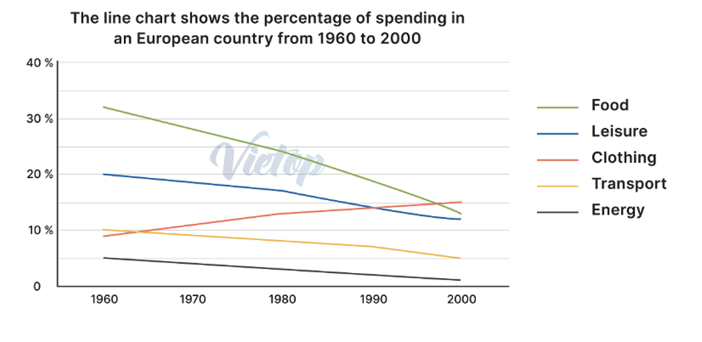
The line graph illustrates the proportion of expenditure in an European country between 1960 and 2000. Overall, the figure for food, leisure , transport and energy decreased while the percentage of clothing rose. Notably, the proportion of food was the most popular ,whereas that of energy was the lowest in 2000. As can be seen in the percentage of food in 1960, which occupied 31%,while that of energy in 1960 just accounted for 5%. Similarly, the percentage of energy was lower than that of food in 1970, recorded at 28% and 4%, respectively. Despite the percentages of food have trend went down from 1980 to 2000, but the proportion of energy still lower than that of food each years. Turning into the percentage of leisure, clothing and transport, In 1960 the proportion of clothing and transport was nearly equal figure, which made up approximately 10%, while the percentage of leisure was twice as much as that of clothing and transport. The proportion of leisure and transport declined between 1970 to 2000, but in 1990 the percentage of transport and leisure have the same percent, which made up 15%.
Detail Sampel
The line chart shows the percentage of spending in an European country from 1960 to 2000.
19/07/2026 09:23 5.5 skor
Topik
The line chart shows the percentage of spending in an European country from 1960 to 2000.
Jumlah kata: 188
Grafik/Diagram
Essay
Skor Keseluruhan
5.5±0.5
Dasar
Skor Kriteria Writing
TA6.0
CC6.0
LR6.0
GRA5.0
Task Achievement6.0
Target: 7.0
Kesalahan:0
Coherence & Cohesion6.0
Target: 7.0
Kesalahan:1
Lexical Resource6.0
Target: 7.0
Kesalahan:4
Grammar & Accuracy5.0
Target: 7.0
Kesalahan:0
Klik teks yang ditandai di esai untuk melihat saran detail untuk peningkatan.
Analisis mendalam
Task 1 - Academic Writing
4 tools available
Esai contoh - IELTS Writing Task 1
Belum ada esai contoh
Silakan klik tombol di bawah untuk menganalisis dan membuat esai contoh berkualitas tinggi untuk Task 1.