
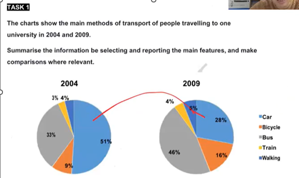
The pie charts illustrate the percentage of students travelling to a university by different means of transport in 2004 and 2009. Overall, there was an increase in the number of users in all modes examined, except for cars, which experienced a decline. In addition, buses overtook cars to become the most widely used in 2009. The proportion of people driving to school started at 51%, after which it witnessed a sharp decrease to 28%. Conversely, an opposite change can be seen in the figure for buses, which rose from 33% to 46%, surpassing cars to become the most popular vehicle. In 2004, 9% of university students chose bicycles to travel to their school, followed by a two-fold growth to 16% in 2009. Similarly, the figures for train and walking also went up, reaching 4% and 6%, respectively. Despite this rise, these two means of transport consistently attracted the fewest people in both years.
Detail Sampel
The charts show the main methods of transport of people travelling to one university in 2004 and 2009.
19/07/2026 16:31 7.5 skor
Topik
The charts show the main methods of transport of people travelling to one university in 2004 and 2009.
Jumlah kata: 153
Grafik/Diagram
Essay
Skor Keseluruhan
7.5±0.5
Baik
Skor Kriteria Writing
TA8.0
CC8.0
LR7.0
GRA7.0
Klik teks yang ditandai di esai untuk melihat saran detail untuk peningkatan.
Analisis mendalam
Task 1 - Academic Writing
4 tools available
Esai contoh - IELTS Writing Task 1
Belum ada esai contoh
Silakan klik tombol di bawah untuk menganalisis dan membuat esai contoh berkualitas tinggi untuk Task 1.