
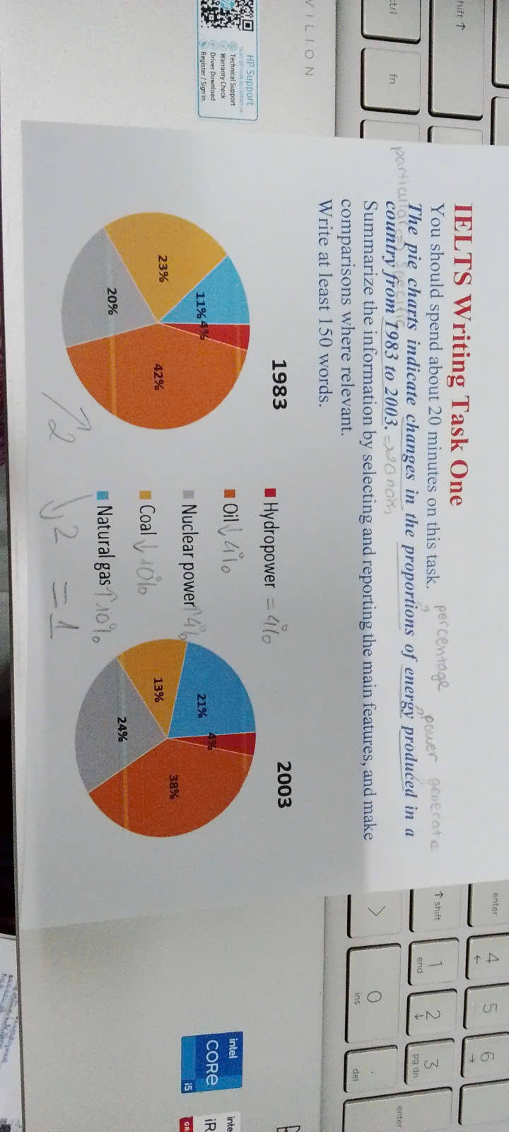
Given are the two pie charts illustrating how a significant change in the percentage of power produced in a country, over a 20-year period, from 1983 to 2003. Overall, it is evident that there was a steady increase in the shares of nuclear power and natural gas. However, the figures of oil and coal experienced gradually decrease. Furthermore, the rate of hydropower remained unchanged over period. According to the pie charts, nuclear power and natural gas followed a sustainable rise to the share of energy generate. They were climb from 20 percent and 11 percent in 1983 to 24 percent and 21 percent in 2003, respectively. In contrast, the proportions of oil and coal underwent a noticeable fall. Between 1983 and 2003, there were having decline from 42 percent and 23 percent to 38 percent and 13 percent. In particularly, although the figure of oil showed drop, which was still account for the largest power generate. Moreover, the percentage of hydropower remained unchanged at 4 percent, during period.
Detail Sampel
the pie charts indicate changes in the proportions of energy produced in a country from 1983 to 2003.
19/07/2026 16:48 6.0 skor
Topik
the pie charts indicate changes in the proportions of energy produced in a country from 1983 to 2003.
Jumlah kata: 168
Grafik/Diagram
Essay
Skor Keseluruhan
6.0±0.5
Cukup
Skor Kriteria Writing
TA6.0
CC6.0
LR6.0
GRA6.0
Klik teks yang ditandai di esai untuk melihat saran detail untuk peningkatan.
Analisis mendalam
Task 1 - Academic Writing
4 tools available
Esai contoh - IELTS Writing Task 1
Belum ada esai contoh
Silakan klik tombol di bawah untuk menganalisis dan membuat esai contoh berkualitas tinggi untuk Task 1.