
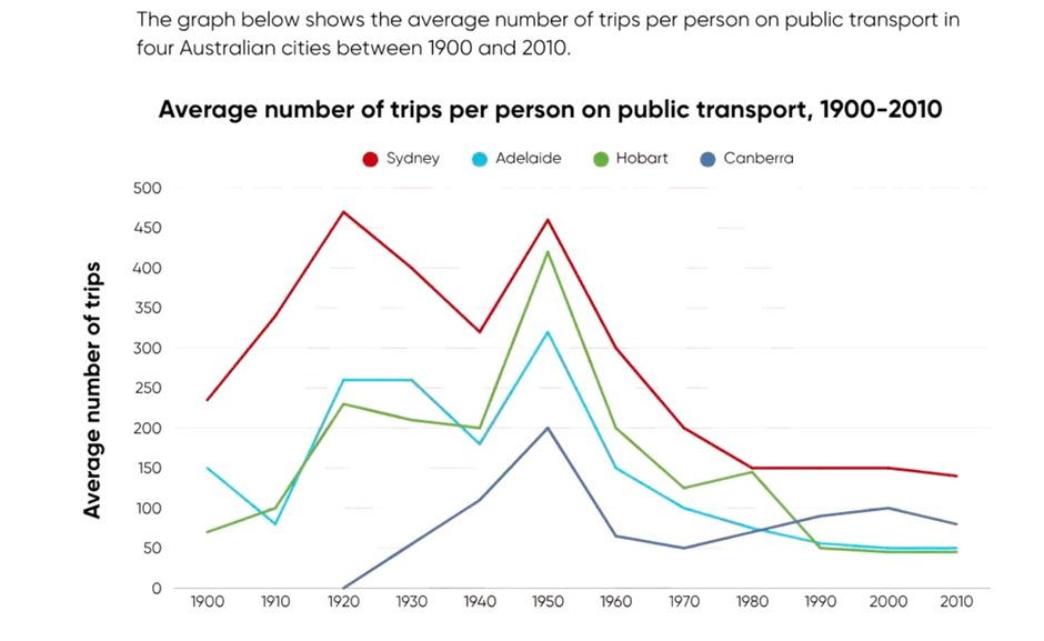
The line graph illustrates the average number of person who traveled on public transport in four different Australian cities from 1900 to 2010. Between 1900 and 1920, the quantity of trips which went by public transport both in Sydney and Habart increased strongly in turn from 230 to 475 and 75 to 225 over time.Meanwhile, the average number of the Adelaide city started 150 was fall down to 75 and after that it is up to 250. In additon, the Canberra did not appear in this time. From 1920 to 1950, the findings of using public transport of per individuals' trip in Sydney and Habart were decreased with 325 and 180 and in 1940 both increased steady. The Adelaide city unchanged from 1920 to 1930. The other is Camberria was grown to 200. After that time, in four different city were even decrease strongly over time between 1950 to 2010. Overall, the number of Sydney is the largest on public transport and the remaining three cities was grew and decreased stably over time.
নমুনা বিস্তারিত
The graph below shows the average number of trips per person on public transport in four Australian cities between 1900 and 2010.
19/07/2026 17:51 5.0 স্কোর
টপিক বা বিষয়
The graph below shows the average number of trips per person on public transport in four Australian cities between 1900 and 2010.
শব্দ সংখ্যা: 173
চার্ট/গ্রাফ
Essay
সামগ্রিক স্কোর
5.0±0.5
প্রাথমিক
রাইটিং মানদণ্ড স্কোর
TA5.0
CC5.0
LR5.0
GRA5.0
উন্নতির জন্য বিস্তারিত পরামর্শ দেখতে প্রবন্ধের হাইলাইট করা যেকোনো লেখায় ক্লিক করুন।
গভীর বিশ্লেষণ
Task 1 - Academic Writing
4 tools available
নমুনা রচনা - IELTS Writing Task 1
কোনো নমুনা রচনা নেই
টাস্ক ১-এর জন্য উচ্চমানের নমুনা রচনা বিশ্লেষণ এবং তৈরি করতে নিচের বাটনে ক্লিক করুন।