
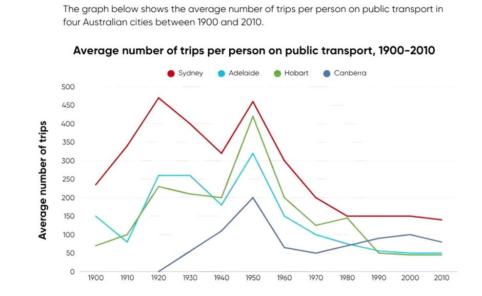
The line graph illustrates the average number of trips per person made by public transport in four Australian cities between 1900 and 2010. Overall, Sydney had the highest average number of trips throughout most of the period. Although the figures for the other three cities fluctuated, all four cities showed a downward trend towards the end. Sydney rose sharply from about 230 trips in 1900 to around 470 in 1920 before falling to 320 in 1940. It then reached another peak of about 460 in 1950 and gradually declined to 140 in 2010. Similarly, Hobart increased from 70 to about 230 between 1900 and 1920, peaked at around 420 in 1950, and then dropped to about 50 by the end. Adelaide fell slightly in the first decade before rising to about 260 in 1920. After reaching 320 in 1950, its figure decreased steadily to around 45. Canberra first appeared in 1920, climbed to 200 in 1950, and finished at about 80 trips.
নমুনা বিস্তারিত
The graph below shows the average number of trips per person on public transport in four Australian cities between 1900 and 2010.
19/07/2026 17:57 7.0 স্কোর
টপিক বা বিষয়
The graph below shows the average number of trips per person on public transport in four Australian cities between 1900 and 2010.
শব্দ সংখ্যা: 162
চার্ট/গ্রাফ
Essay
সামগ্রিক স্কোর
7.0±0.5
ভালো
রাইটিং মানদণ্ড স্কোর
TA7.0
CC7.0
LR7.0
GRA7.0
উন্নতির জন্য বিস্তারিত পরামর্শ দেখতে প্রবন্ধের হাইলাইট করা যেকোনো লেখায় ক্লিক করুন।
গভীর বিশ্লেষণ
Task 1 - Academic Writing
4 tools available
নমুনা রচনা - IELTS Writing Task 1
কোনো নমুনা রচনা নেই
টাস্ক ১-এর জন্য উচ্চমানের নমুনা রচনা বিশ্লেষণ এবং তৈরি করতে নিচের বাটনে ক্লিক করুন।