
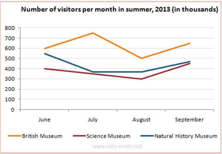
The given line graph illustrates how many people visited three museums in London from June to September in 2013. Overall, there was upward trends in 3 different types of country. Addtional, the number of visitors in British Museum has the highest figures, while it was opposite for Natural History Museum Starting 600,000 visitors in june, the number of visitors in British Museum increased significantly yo around 750,000 visitors in july. In addtion to, the figures for British Museum decreased considerbly to 500,000 visitors after 1 month, and this figure climbed to only 650,000 visitors in September Looking 550,000 visitors in June, the number of Visitors in Science Museum declined subsequently by 70,000 visitors and this figure remained unchanged to August. Additionally, this fugure went up slightly by 100,000 visitors in September. Visitors in Natural History Museum in June stood at 550,000, and this figure went down significanly to 300,000 visitors in August and increased only 450,000 visitors.
รายละเอียดตัวอย่าง
The given line graph show how many people visited three museums in London from June to September in 2013.
19/07/2026 18:01 5.0 คะแนน
หัวข้อ
The given line graph show how many people visited three museums in London from June to September in 2013.
จำนวนคำ: 157
แผนภูมิ/กราฟ
Essay
คะแนนรวม
5.0±0.5
พื้นฐาน
คะแนนเกณฑ์การเขียน
TA5.0
CC5.0
LR5.0
GRA5.0
คลิกข้อความที่ไฮไลต์ในเรียงความเพื่อดูคำแนะนำรายละเอียดเพื่อพัฒนา
การวิเคราะห์เชิงลึก
Task 1 - Academic Writing
4 tools available
บทความตัวอย่าง - IELTS Writing Task 1
ยังไม่มีบทความตัวอย่าง
กดปุ่มด้านล่างเพื่อวิเคราะห์และสร้างบทความตัวอย่างคุณภาพสูงสำหรับ Task 1