
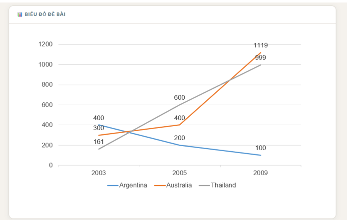
The given line graph illustrates the number of cars manufactured in three different nations, namely Argentina, Australia and Thailand, between 2003 and 2009. Overall, it is evident that the figure for cars produced in almost all countries experienced an upward trend, with the most significant increase can be seen in Thailand. While, the number of cars produced in Argentina showed a slightly decrease in the end of the period. Looking first at the climb group, the quantity of cars manufactured in Thailand witnessed an upward trend, which registered at 161 in 2003 then experiencing a dramatically rise to 999 in the end of time-frame. Similarly, albeit less pronounced, was seen in the number of Australia’s cars produced. Which started at 300 initially then witnessing mildly increasing to 300 in 2005, before relatively reach a peak at 1191 to become the lead factors in 2009. Focus on another group, the figure for car was manufactured in Argentina showed a converse trend, whose quantity was being the highest number of cars produced in the initial year standing at 400, before experiencing a downward trend to roughly 100 in the last year.
รายละเอียดตัวอย่าง
The line chart below shows the number of cars produced in three countries from 2003 to 2009. Summarise the information by selecting and reporting the main features, and make comparisons where relevant.
19/07/2026 19:35 6.5 คะแนน
หัวข้อ
The line chart below shows the number of cars produced in three countries from 2003 to 2009. Summarise the information by selecting and reporting the main features, and make comparisons where relevant.
จำนวนคำ: 189
แผนภูมิ/กราฟ
Essay
คะแนนรวม
6.5±0.5
ดีพอใช้
คะแนนเกณฑ์การเขียน
TA7.0
CC7.0
LR6.0
GRA6.0
คลิกข้อความที่ไฮไลต์ในเรียงความเพื่อดูคำแนะนำรายละเอียดเพื่อพัฒนา
การวิเคราะห์เชิงลึก
Task 1 - Academic Writing
4 tools available
บทความตัวอย่าง - IELTS Writing Task 1
ยังไม่มีบทความตัวอย่าง
กดปุ่มด้านล่างเพื่อวิเคราะห์และสร้างบทความตัวอย่างคุณภาพสูงสำหรับ Task 1