
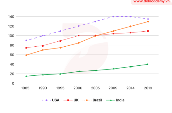
The chart illustrates the percentage of capita meat consumption in four different countries over a 34-year period, starting from 1985. Overall, what is notable from the chart is that all countries experienced an upward trend. Moreover, among all the countries, the USA dominated the meat consumption during the entire surveyed period. In 1985, the percentage of meat consumption in the USA was about 90%, which was almost 70% higher than the figure for India. The UK and Brazil showed differences, ranging from 60% to nearly 78%. Thereafter, the proportion of meat consumption in the USA increased sharply to 140% in 2014 before declining slightly to around 135% in 2019, still the largest meat consumer. Likewise, the UK and Brazil followed a similar pattern, but to a lesser extent, reaching nearly 110% and 130% at the end of the period, respectively. Finally, the consumption of meat in India recorded a marginal rise to exactly 40% in the final year.
Detail Sampel
The line chart shows the per capita meat consumption in four different countries (USA, UK, India, Brazil) from 1985 to 2019.
19/07/2026 19:56 7.0 skor
Topik
The line chart shows the per capita meat consumption in four different countries (USA, UK, India, Brazil) from 1985 to 2019.
Jumlah kata: 158
Grafik/Diagram
Essay
Skor Keseluruhan
7.0±0.5
Baik
Skor Kriteria Writing
TA7.0
CC7.0
LR7.0
GRA7.0
Klik teks yang ditandai di esai untuk melihat saran detail untuk peningkatan.
Analisis mendalam
Task 1 - Academic Writing
4 tools available
Esai contoh - IELTS Writing Task 1
Belum ada esai contoh
Silakan klik tombol di bawah untuk menganalisis dan membuat esai contoh berkualitas tinggi untuk Task 1.