
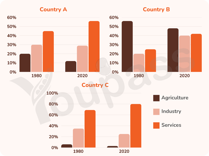
The three bar charts illustrate the proportion of employees being distributed to three different categories, namely agriculture, industries, and services. These are compared in percentage in two distinct time points: 1980 and 2020. Overall, there was many evident trend after the fourty-year period. While the figure of services and industry in all countries saw an upward trend, the one of agriculture decreased. Notably, the number of employments spent on services was the dominant in the country A and C, and the agriculture only dominated in country B throughout. Regarding the two country where the need for industry and services increased significantly, in 1980, the leading criteria was services in both country A and C, with roughly 44% and 70%, respectively. At the same time, the figure of industry stood at approximately 30%, slightly higher than agriculture at around 20% in county A. The trend was likely to remain stable after the next fourty years, the employments of services in country A reached its peak at over 55% in 2020, however, the two remaining criteria decreased modestly, industry fell slightly to just over 28%, and the agricultre significantly dipped to rougly 11%. In terms of country C, the proportion was familiar with country A, with services dominated in 1980, with about 70%, industry and services stood at roughly 37% and 5% respectively. In the next time point, the services increased to its highest point at neraly 80%, whereas the the industry dropped to over 21% and the agriculture only accounted for 2%. As for the remaining country, the leading category throughout the period was the country B, with nearly 55%, considerably higher than industry with 20% and sevices occupied for about 25%. In 2020, the two lower categories increased drastically to roughly 40% for industry and over 43% for services, whereas the percentage of argriculture decreased to just over 47%.
Sample Detail
The bar chart shows the distribution of employment among agriculture, services, industries in three countries in 1980 and 2020.
20/07/2026 04:37 6.5 points
Topic
The bar chart shows the distribution of employment among agriculture, services, industries in three countries in 1980 and 2020.
Word count: 309
Chart/Graph
Essay
Overall Scores
6.5±0.5
Fair
Writing Criteria Scores
TA7.0
CC7.0
LR6.0
GRA6.0
Click on any highlighted text in the essay to view detailed suggestions for improvement.
Deep Analysis
Task 1 - Academic Writing
4 tools available
Sample Essay - IELTS Writing Task 1
No sample essay
Click the button below to analyze and generate a high-quality sample essay for Task 1.