
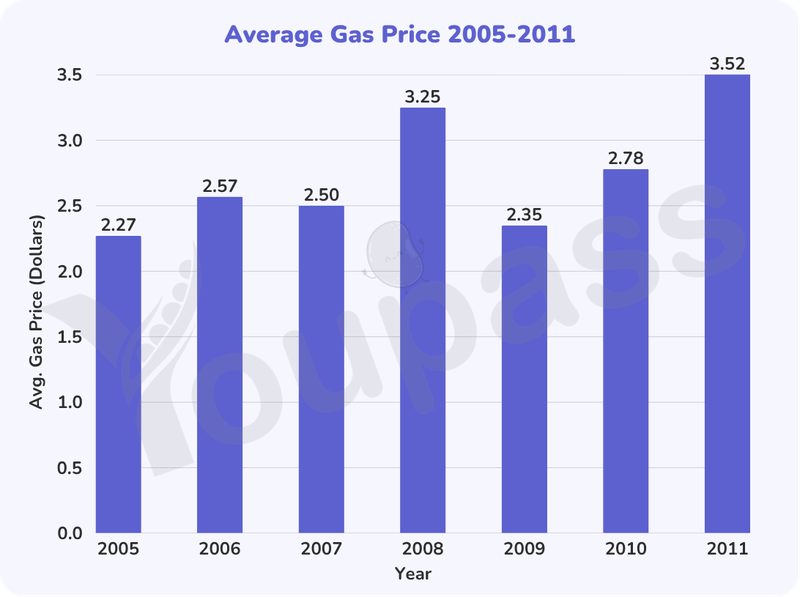
The given bar chart illustrates the average price of gas, measured by dollars, in two states in the USA between 2005 and 2011. Overall, it can be seen that the gas price generally increased throughout the period despite the sharp fluctuation in particular years. Notably, 2008 and 2011 respectively recorded the highest price of gas in two states of the USA. Commencing at 2.27 in 2005, the price of gas grew slightly to 2.5 in the next year before a decline to 2.50 in 2007. It then surged to 3.25 in 2008, one and a half higher than its initial figure, ending the first period with a remarkable growth in spite of slight varietion. However, the high average of gas price did not remained in a long time as it immediately plummeted to 2.35 in 2009, even lower than that in previous years. In two years later, the figure saw a recovery when people in the USA paid 2.78 for gas in 2010, comparatively higher than the gas expenditure in 2009. The price of gas ultimately exhibited a noticeable increase and peaked at 3.52 in the final year of the period.
Sample Detail
The bar chart shows the price of fuel in two states in the USA from 2005 to 2011. Summarise the information by selecting and reporting the main features, and make comparisons where relevant.
20/07/2026 06:24 6.5 points
Topic
The bar chart shows the price of fuel in two states in the USA from 2005 to 2011. Summarise the information by selecting and reporting the main features, and make comparisons where relevant.
Word count: 191
Chart/Graph
Essay
Overall Scores
6.5±0.5
Fair
Writing Criteria Scores
TA7.0
CC7.0
LR6.0
GRA7.0
Click on any highlighted text in the essay to view detailed suggestions for improvement.
Deep Analysis
Task 1 - Academic Writing
4 tools available
Sample Essay - IELTS Writing Task 1
No sample essay
Click the button below to analyze and generate a high-quality sample essay for Task 1.