
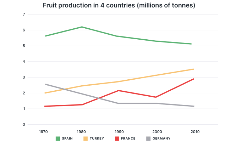
The line graph illustrates how many fruit manufactured across four different nations including France, Spain, Germany, and Turkey between 1970 and 2010. Overall, it is observed that while Spain and Germany experienced a downward trend, Turkey and France recorded an upward tendency. Notably, Spain remained the leading position throughout the period. Looking first at countries that had increasing trend, Turkey grew progressively from 2 million in 1970 to around 3.5 million in 2010. By contrast, fruit production in France started with around 1.1 million before rising considerably to 2.2 million in 1990, which was followed by a decline to approximately 1.8 million in 2000. This figure hit a peak of 2.9 million in 2010. Turning to the remaining countries, Spain initially accounted for around 5.7 million before increasing significantly and hitting a peak of 6.2 million in 1980. Subsequently, this country experienced a consistent decline and falled to a minimum of about 5.1 million in 2010. Additionally, Germany decreased sharply to around 1.3 million in 1990 before plunging to the lowest point at 1.1 million at the end of the period.
Sample Detail
The graph shows the amount of fruit produced in four countries (France, Spain, Germany, Turkey) from 1970 to 2010.
20/07/2026 06:53 7.0 points
Topic
The graph shows the amount of fruit produced in four countries (France, Spain, Germany, Turkey) from 1970 to 2010.
Word count: 181
Chart/Graph
Essay
Overall Scores
7.0±0.5
Good
Writing Criteria Scores
TA7.0
CC8.0
LR6.0
GRA7.0
Click on any highlighted text in the essay to view detailed suggestions for improvement.
Deep Analysis
Task 1 - Academic Writing
4 tools available
Sample Essay - IELTS Writing Task 1
No sample essay
Click the button below to analyze and generate a high-quality sample essay for Task 1.