
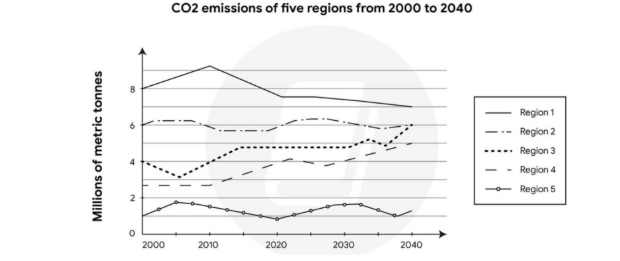
The given graph illustrates the CO2 emissions of five regions from 2000 to 2020, and predicted to up the year 2040. Overall the numbers of metric tones that had in region 1 was the highest in the timeframe, while region 5 got the lowest counts of metric tones in 4 decades. In recent decades, the numbers of metric tones in region 1 experienced a slightly increase and become a peak of the graph in 2010. After that CO2 emissions in region 1 plunge from approximately 9 to 7 in 2040. The numbers of CO2 emissions in region 3 dip slightly from 4 to 3 in 2005 and it ungone a steadily rise from 3 to 5 in 2040. Similary with region 3, the count of metric tones in region 4 climbed from about 3 to 5 in 40 years later. Unlike with region 1, 3, 4, the numbers of CO2 emissions in region 2 and 5 remain stable in 4 decades.
Sample Detail
The graph below shows the CO2 emissions of five regions from 2000 to 2020, and predicted to up the year 2040
20/07/2026 08:32 5.0 points
Topic
The graph below shows the CO2 emissions of five regions from 2000 to 2020, and predicted to up the year 2040
Word count: 161
Chart/Graph
Essay
Overall Scores
5.0±0.5
Basic
Writing Criteria Scores
TA5.0
CC6.0
LR5.0
GRA5.0
Click on any highlighted text in the essay to view detailed suggestions for improvement.
Deep Analysis
Task 1 - Academic Writing
4 tools available
Sample Essay - IELTS Writing Task 1
No sample essay
Click the button below to analyze and generate a high-quality sample essay for Task 1.