
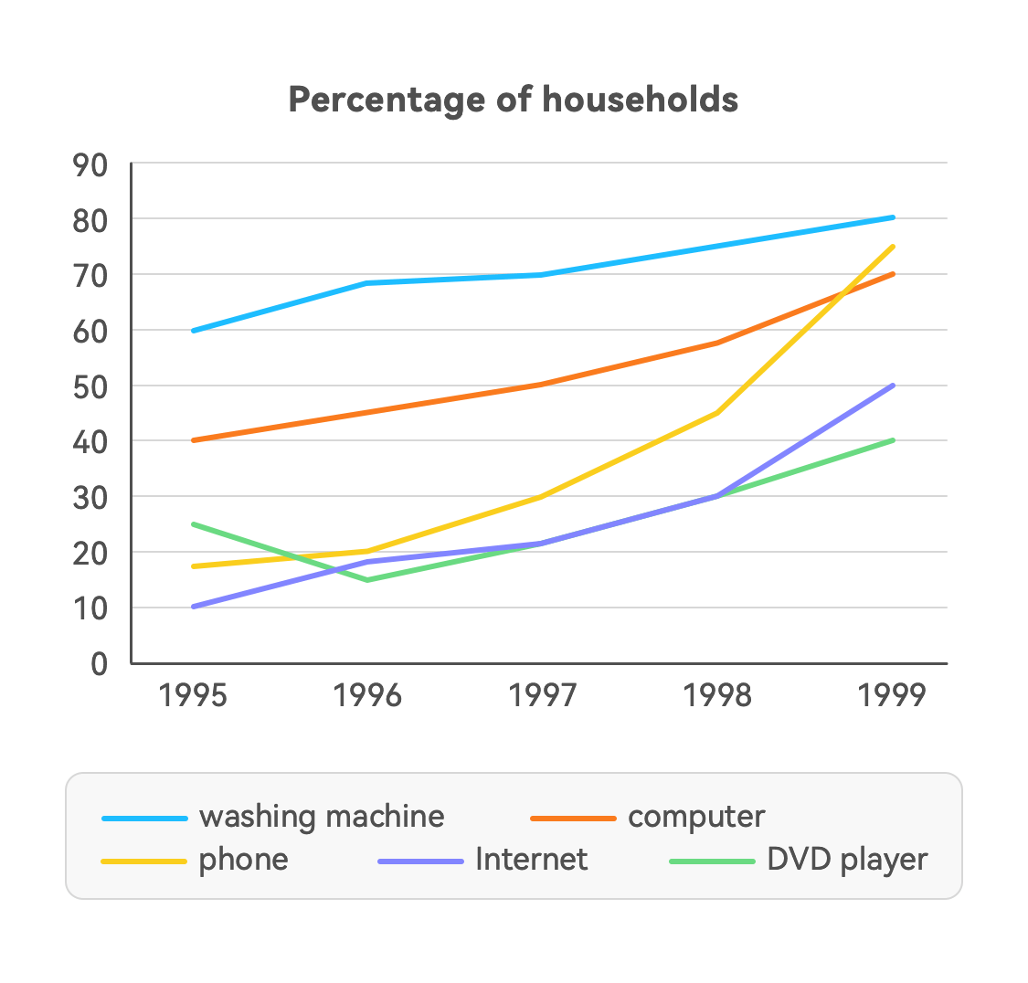
The line graph illustrates the proportion of household with various kinds of technology, including washing machine, computer, phone, Internet, and DVD player, in the United States between 1995 and 1999. It is noticeable that except DVD player, all experienced an upward trend; moreover, the percentage of Internet and phone saw a significant increase, while DVD player witnessed an upturn. In 1995, the proportion of washing machine was the leader with 60%, followed by computer, DVD player, phone, and Internet, respectively. 1996 saw a decrease in the percentage of DVD player by a half of the beginning, whereas, that of phone and Internet grew moderately. Meanwhile, in next three years, there was a dramatic growth in the proportion of DVD player, Internet, and phone, which were all by more than 40%, the former reached at 40%, the middle achieved at 50%, and the latter attended more than 70% . This made the figure of phone ranked at second at the end of the period. Additionally, that of washing machine and computer still went up steadily both by 20%.
Sample Detail
The graph below shows the percentage of households with different kinds of technology in the U.S. from 1995 to 1999. Summarize the information by selecting and reporting the main features, and make comparisons where relevant. Write at least 150 words.
20/07/2026 08:40 6.0 points
Topic
The graph below shows the percentage of households with different kinds of technology in the U.S. from 1995 to 1999. Summarize the information by selecting and reporting the main features, and make comparisons where relevant. Write at least 150 words.
Word count: 177
Chart/Graph
Essay
Overall Scores
6.0±0.5
Fair
Writing Criteria Scores
TA6.0
CC6.0
LR6.0
GRA6.0
Click on any highlighted text in the essay to view detailed suggestions for improvement.
Deep Analysis
Task 1 - Academic Writing
4 tools available
Sample Essay - IELTS Writing Task 1
No sample essay
Click the button below to analyze and generate a high-quality sample essay for Task 1.