
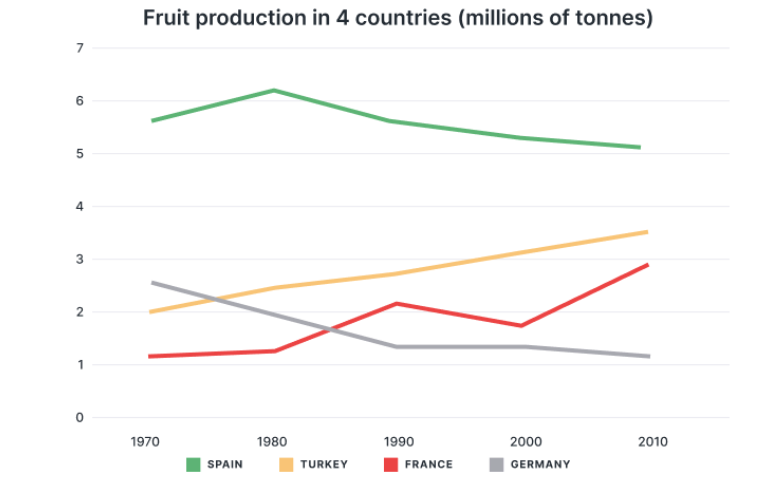
The line graph displays how much fruit did four nations produced from 1970 to 2010, which include Spain, Turkey, France and Germany. Overall, it is tangible that most nations witnessed a rise in the amount of yield, except for Germany. Additionally, Spain remained the biggest fruit producer among four countries. In terms of the two biggest fruit producers in the year of 1970, the amount of Spanish fruit production was the highest, staring with around 5.6 million tonnes, after reaching the peak of 6.2 millions, the output of Spain began to go down gradually. Despite witnessing a decrease, Spain still remained the biggest producer tittle. Following that of Spain in 1970, Germany set off with around 2.5 millions of tonnes, after which, the output decreased significantly before becoming the smallest fruit producer with around 1 tonnes in 2010. Pertaining to the two lowest figures, Turkey was the higher one with the yield of 2 tonnes in the 1970. After having a gradual decrease, Turkish fruit production marked at 3.5 millions, claiming the second biggest producers. Finally, France was the smallest producer, after commencing with almost 1 tonnes, the French fruit production rises to more than 2 millions in 1990. After witnessing fluctuation, France ending at nearly 3 million tonnes of fruit, lower than that of Turkey 0,5 millions.
Sample Detail
The graph shows the amount of fruit produced in four countries (France, Spain, Germany, Turkey) from 1970 to 2010.
20/07/2026 09:22 6.0 points
Topic
The graph shows the amount of fruit produced in four countries (France, Spain, Germany, Turkey) from 1970 to 2010.
Word count: 218
Chart/Graph
Essay
Overall Scores
6.0±0.5
Fair
Writing Criteria Scores
TA6.0
CC6.0
LR6.0
GRA6.0
Click on any highlighted text in the essay to view detailed suggestions for improvement.
Deep Analysis
Task 1 - Academic Writing
4 tools available
Sample Essay - IELTS Writing Task 1
No sample essay
Click the button below to analyze and generate a high-quality sample essay for Task 1.