
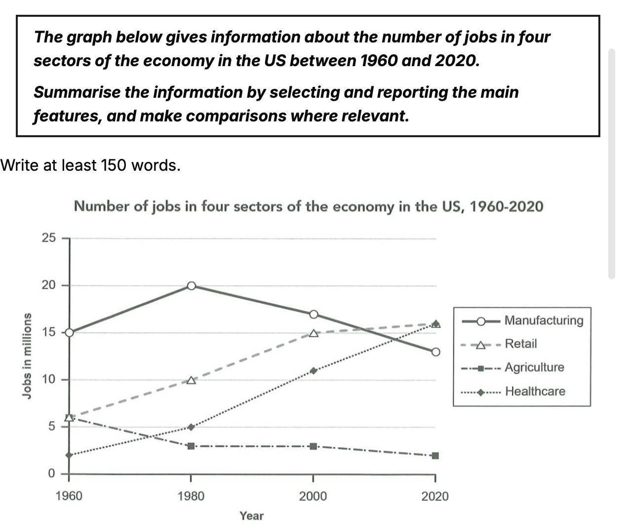
The line graph compares how many jobs had in four industries in the US economy from 1960 to 2020. Overall, it can be seen that while Manufacturing and Agriculture become less prominent in job market, Retail and Healthcare showed the reverse trend. Additionally, the figure for manufacturing was the largest share in the majority of the period,before ceding its dominance to Retail and Healthcare. Looking firstly at the decreasing categories, it first two decades, Manufacturing and Agriculture showed an opposite trend. The figure for Manufacturing increased by 5 million while that for Agriculture experienced a slight fall from roughly 6 million to approximately 3 million. The rest of the period, jobs of Manufacturing decreased significantly by 7 million, that of Agriculture leveled off in 2000, prior to falling to about 2 million by the end. Concerning the increasing categories, Retailed stood at the same spot with Agriculture initially around 6 million, whereas Healthcare was the lowest share of the job provider. Over the following forty years, both of those experienced a comparable increase of approximately 9 million. Lastly, they matched to roughly 16 million at the end of the period.
Sample Detail
the graph below gives information about the number of jobs in four sectors in the US economy between 1960 and 2020
20/07/2026 09:42 6.5 points
Topic
the graph below gives information about the number of jobs in four sectors in the US economy between 1960 and 2020
Word count: 190
Chart/Graph
Essay
Overall Scores
6.5±0.5
Fair
Writing Criteria Scores
TA7.0
CC7.0
LR6.0
GRA6.0
Click on any highlighted text in the essay to view detailed suggestions for improvement.
Deep Analysis
Task 1 - Academic Writing
4 tools available
Sample Essay - IELTS Writing Task 1
No sample essay
Click the button below to analyze and generate a high-quality sample essay for Task 1.