
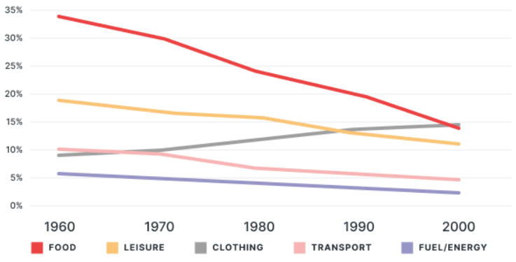
The line chart presents the percentages of total spending across five categories: Food, Leisure, Clothing, Transport and Fuel/Energy in an European nation from 1960 to 2000. Overall, whereas the majority of categories witnessed a downward trend, the opposite was true for Clothing, which experienced a rise. Although Food started as the dominant category, it was eventually overtaken by Clothing toward the end of the timeframe. Food and Clothing followed opposite patterns with the former generally declining, as the latter increased. To be more specific, between 1960 and 2000, a decline trend can be seen in the figure for Food, which gradually dropped from roughly 34% to nearly 14% at the end of the period. On the other hand, there was a modest increase in the proportion of Clothing, rising from about 9% to almost 15% and reaching parity with Food at the end of the period shown. The percentage of Leisure experienced a moderate decrease from 19% in 1960 to 11% in 2000. A similar downward trend, but less pronounced, was evident in the figures for Transport, which dropped from 10% to 5% between 1960 and 2000. Finally, the proportion of Fuel/Energy displayed a steady decline, starting at 6% in 1960 before falling by 1% every ten-year period.
รายละเอียดตัวอย่าง
The line graph illustrates the proportion of total expenditure in a certain European country between 1960 and 2000.
20/07/2026 09:43 7.0 คะแนน
หัวข้อ
The line graph illustrates the proportion of total expenditure in a certain European country between 1960 and 2000.
จำนวนคำ: 208
แผนภูมิ/กราฟ
Essay
คะแนนรวม
7.0±0.5
ดีมาก
คะแนนเกณฑ์การเขียน
TA7.0
CC8.0
LR7.0
GRA7.0
คลิกข้อความที่ไฮไลต์ในเรียงความเพื่อดูคำแนะนำรายละเอียดเพื่อพัฒนา
การวิเคราะห์เชิงลึก
Task 1 - Academic Writing
4 tools available
บทความตัวอย่าง - IELTS Writing Task 1
ยังไม่มีบทความตัวอย่าง
กดปุ่มด้านล่างเพื่อวิเคราะห์และสร้างบทความตัวอย่างคุณภาพสูงสำหรับ Task 1