
The bar charts illustrate the proportion of people living in urban areas across selected regions of the world, as well as the global average, both in 1950, 2000, with predictions for 2030. Overall, the percentage of the population rising in cities is expected to rise steadily in all four different categories throughout the period. Latin America remains the most highly urbanized area, whereas Afirca and Asia have experienced an upward trend despite starting from much lower levels. Regarding the highest figures, around 50% of the population of Latin America lived in the urban areas in 1950. This proportion increased significantly to approximately 70% in 2000 and it is projected to reach 90% in 2030. Meanwhile, the global average stood at 30% at the beginning of the period before rising to 60% at the end of the period. By contrast, Africa had the lowest level of urbanization in 1950, at roughly 12% before increasing to just under 40% in 2000. It is forecast to continue its upward trend, reaching 50% by 2030. Asia started at the beginning of the period with 15%; it experienced steady growth to under 50% in 2000 before rising to 55% at the end of the period.
Sample Detail
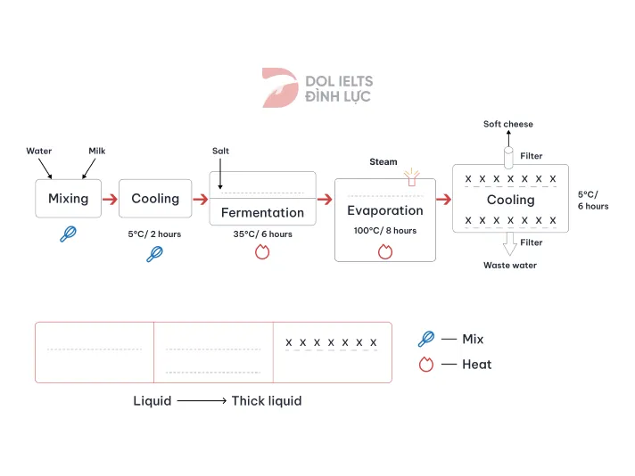
The diagram below shows the process of making soft cheese. Summarize the information by selecting and reporting the main features, and make comparisons where relevant.
20/07/2026 09:51 5.5 points
Topic
The diagram below shows the process of making soft cheese. Summarize the information by selecting and reporting the main features, and make comparisons where relevant.
Word count: 200
Chart/Graph
Essay
Overall Scores
5.5±0.5
Basic
Writing Criteria Scores
TA1.0
CC7.0
LR7.0
GRA7.0
Click on any highlighted text in the essay to view detailed suggestions for improvement.
Deep Analysis
Task 1 - Academic Writing
4 tools available
Sample Essay - IELTS Writing Task 1
No sample essay
Click the button below to analyze and generate a high-quality sample essay for Task 1.