
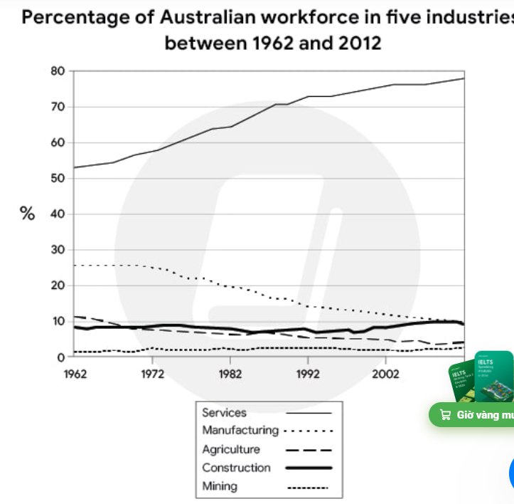
The line chart illustrates the proportion of workers in Australia in five distinct industries from 1962 to 2012. Overall, the percentage of Australian individuals working in services followed an upward trend, which was mirrored by those of construction and mining, while the figure for manufacturing and agriculture showed a reverse pattern. Notably, services maintained its lead over the whole surveyed period, whereas mining consistently recorded the lowest proportion. Regarding industries with increasing numbers of laborers over time, more than half of the Australian workforce were in service industries in 1962. The figure subsequently soared to finish at nearly 80% in 2012, making this sector the most common in Australia. Besides, construction workers accounted for under one-tenth of the total labor force in the first year before fluctuating marginally over the period and ending at approximately 10%, which reached parity with that of the manufacturing industry. Likewise, only around 2% of the laborers worked in the mining sector, which then rose minimally to 3% in 2012, covering the lowest percentage. Concerning sectors showcasing a downward trend, the manufacturing industry attracted roughly 26% of the total workforce before witnessing a drop to about 10% at the end of the time frame. Similarly but to a lesser extent, the proportion of workers in agriculture was approximately 12% in 1962 prior to a decline to roughly 5% over a 50-year period.
Sample Detail
The graph below illustrates the proportion of the Australian workforce employed in five industries over the period from 1962 to 2012. Provide an overview of the information by identifying and describing the key details, and include comparisons where appropriate.
20/07/2026 09:53 7.5 points
Topic
The graph below illustrates the proportion of the Australian workforce employed in five industries over the period from 1962 to 2012. Provide an overview of the information by identifying and describing the key details, and include comparisons where appropriate.
Word count: 227
Chart/Graph
Essay
Overall Scores
7.5±0.5
Good
Writing Criteria Scores
TA7.0
CC8.0
LR8.0
GRA8.0
Click on any highlighted text in the essay to view detailed suggestions for improvement.
Deep Analysis
Task 1 - Academic Writing
4 tools available
Sample Essay - IELTS Writing Task 1
No sample essay
Click the button below to analyze and generate a high-quality sample essay for Task 1.