
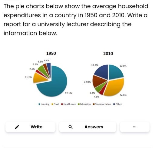
The pie graphs illustrate how the average per house spending on 6 sectors changed between 1950 and 2010 in a country. Overall, it is clear that most of categories increased except for the housing category and that of education over period. The percentages of housing dominated at first year while the opposite was true for food at final year. The budget for housing over 60 years experienced a noticeable drop, 72,1% to 22,0%.Although it was at the highest point in 2010.In addition, the proportion of education drop slightly for only 0,3%. In contrast, food category witness by far an upward trends, from only 11,2% to 34,0 % which became the most popular in final year, surpassing the other. Regarding others, unnamed expenditures and transportation soar around five time at 19,2% and 14,0% respectively in 2010. Household expenditure on health care always was at lowest trend of over period, despite it went up double to approximately 4,5%.
Detail Sampel
The pie charts below show the average household expenditures in a country in 1950 and 2010. Summarise the information by selecting and reporting the main features, and make comparisons where relevant.
20/07/2026 11:53 6.5 skor
Topik
The pie charts below show the average household expenditures in a country in 1950 and 2010. Summarise the information by selecting and reporting the main features, and make comparisons where relevant.
Jumlah kata: 156
Grafik/Diagram
Essay
Skor Keseluruhan
6.5±0.5
Cukup
Skor Kriteria Writing
TA7.0
CC7.0
LR6.0
GRA6.0
Klik teks yang ditandai di esai untuk melihat saran detail untuk peningkatan.
Analisis mendalam
Task 1 - Academic Writing
4 tools available
Esai contoh - IELTS Writing Task 1
Belum ada esai contoh
Silakan klik tombol di bawah untuk menganalisis dan membuat esai contoh berkualitas tinggi untuk Task 1.