
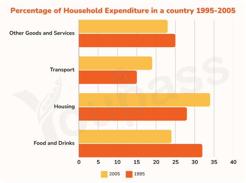
The bar chart illustrates the proportion of domestic spending on goods and services in a nation between 1995 amd 2005. Overall, it can be seen that there was an upward trend in the percentage of housing and transport, whereas an adverse pattern was true for that of food and drinks and other goods and services. Notably, transport remained the least popular service throughout the given period. When it comes to food and drinks, the spending on these goods ranked first at around 32% in 1995 before declining remarkably to around 24% by the end. Similarly, the figure for other goods and services was recorded at the third place in 1995, at roughly 25%, then dropped marginally to 23% by 2005. Turning to the remaining categories, the percentage of spending on transport stood at merely 15% initially before amounting to roughly 18% by the end of the timeframe. Consequently, the figure housing surpassed food and drinks to rank first at approximately 33% in 2005 after accounting for 26% in 1995.
Detail Sampel
The chart shows the percentage of household expenditure on goods and services in a country from 1995 to 2005. Summarise the information by selecting and reporting the main features and make comparisons where relevant.
20/07/2026 16:40 7.5 skor
Topik
The chart shows the percentage of household expenditure on goods and services in a country from 1995 to 2005. Summarise the information by selecting and reporting the main features and make comparisons where relevant.
Jumlah kata: 169
Grafik/Diagram
Essay
Skor Keseluruhan
7.5±0.5
Baik
Skor Kriteria Writing
TA7.0
CC8.0
LR7.0
GRA8.0
Klik teks yang ditandai di esai untuk melihat saran detail untuk peningkatan.
Analisis mendalam
Task 1 - Academic Writing
4 tools available
Esai contoh - IELTS Writing Task 1
Belum ada esai contoh
Silakan klik tombol di bawah untuk menganalisis dan membuat esai contoh berkualitas tinggi untuk Task 1.