
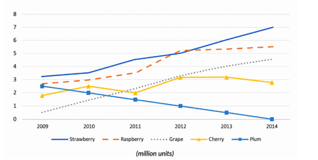
The graph gives information about the revenue of five different kinds of jam over the course of five years from 2009 to 2014. Overall, it can be seen that most kinds of jam fluctuated over 5 years, with the exception of plum jam, decreasing dramatically during that period. Moreover, those of grape saw a considerable increase although it began with the lowest figure. The sales of strawberry jam witnessed a considerable growth from 2009 to 2014, reaching a peak of roughly 7 million units, and became the highest statistic on kinds of jam. During the 2009-2014 period, grape jam's sales rose significantly, from over 0 to just under 5 million units, overtaking those of cherry and plum, at under 3 and 0, correspondingly. The number of raspberry saw a sharp rise, increasing from over 2.5 to roughly 5.5 million units, which was the second highest figure. Between 2009 and 2014, the figure for cherry experienced a fluctuation. That stastistic on cherry poke at over 3 million units and hitted a low of 2 million units. That of plum declined gradually, hitting a low of 0 million units in 2014.
Sample Detail
The chart shows the sales of five different kinds of jam from 2009 to 2014
20/07/2026 17:24 6.5 points
Topic
The chart shows the sales of five different kinds of jam from 2009 to 2014
Word count: 189
Chart/Graph
Essay
Overall Scores
6.5±0.5
Fair
Writing Criteria Scores
TA7.0
CC7.0
LR6.0
GRA7.0
Click on any highlighted text in the essay to view detailed suggestions for improvement.
Deep Analysis
Task 1 - Academic Writing
4 tools available
Sample Essay - IELTS Writing Task 1
No sample essay
Click the button below to analyze and generate a high-quality sample essay for Task 1.