
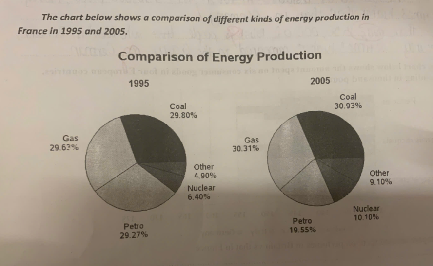
The pie chart illustrates the percentages of numerous kinds of energy production in France from 1995 to 2005. Overall, the figure for coal and gas generated the highest energy production over the period shown, whereas petrol declined significantly and nuclear increased gradually between 1995 and 2005. Meanwhile, others jointly recorded the lowest figure throughout the period. Gas accounted for 30.31% of total energy production in 2005, nearly 1% higher than in 1995. By comparison, there was a marginal increase in coal from 29.80% in 1995 to 30.93% in 2005. Additionally, the figure for other sources occupied an insignificant proportion of total energy production, reaching 4.90% in 1995, before rising to 9.10% in 2005. In contrast, the percentage of petrol stood at 19.55% in 2005, which was around 10% lower than that in 1995. Finally, nuclear constituted 6.40% of total energy production in 1995, followed by a steady rise to 10.10% in 2005.
รายละเอียดตัวอย่าง
the chart below shows a comparison of different kinds of energy production in France in 1995 and 2005.
20/07/2026 17:40 7.0 คะแนน
หัวข้อ
the chart below shows a comparison of different kinds of energy production in France in 1995 and 2005.
จำนวนคำ: 152
แผนภูมิ/กราฟ
Essay
คะแนนรวม
7.0±0.5
ดีมาก
คะแนนเกณฑ์การเขียน
TA7.0
CC7.0
LR7.0
GRA7.0
คลิกข้อความที่ไฮไลต์ในเรียงความเพื่อดูคำแนะนำรายละเอียดเพื่อพัฒนา
การวิเคราะห์เชิงลึก
Task 1 - Academic Writing
4 tools available
บทความตัวอย่าง - IELTS Writing Task 1
ยังไม่มีบทความตัวอย่าง
กดปุ่มด้านล่างเพื่อวิเคราะห์และสร้างบทความตัวอย่างคุณภาพสูงสำหรับ Task 1