
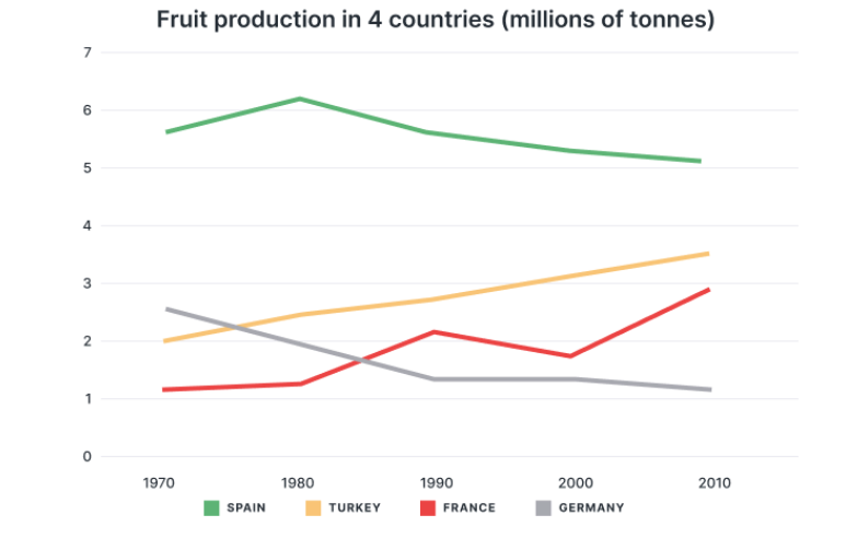
The line chart compares the fruit production in France, Spain, Germany and Turkey over a period of 40 years. It is clear that Spain had the highest number of fruit over the period. Meanwhile, the amount of fruit production in Germany dropped to the lowest. In 1970, Spain dominated the graph with more five millions of tonnes before reached a peak of around six millions of tonnes in 1980. In 30 years after, the fruit in Spain slightly decreased to around five millions at the end. By contrast, the fruit of Germany was the secondary in 1970. Then it significantly declined at roundly one million in 1990 and stayed unchanged to 2010. In the other hand, Turkey witnessed a gradually increase trend with the figure for fruit produced rose from two millions of tonnes to more three millions of tonnes. In France, the data remained stable in 1980. After that, it fluctuated during almost the period and acheived nearly three millions in 2010.
Sample Detail
The graph shows the amount of fruit produced in four countries (France, Spain, Germany, Turkey) from 1970 to 2010.
20/07/2026 09:39 6.0 points
Topic
The graph shows the amount of fruit produced in four countries (France, Spain, Germany, Turkey) from 1970 to 2010.
Word count: 163
Chart/Graph
Essay
Overall Scores
6.0±0.5
Fair
Writing Criteria Scores
TA6.0
CC6.0
LR6.0
GRA6.0
Click on any highlighted text in the essay to view detailed suggestions for improvement.
Deep Analysis
Task 1 - Academic Writing
4 tools available
Sample Essay - IELTS Writing Task 1
No sample essay
Click the button below to analyze and generate a high-quality sample essay for Task 1.