
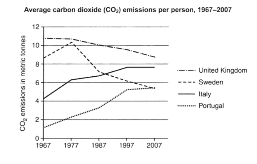
The line chart illstrates the amount of C02 gases was emitted by one person from four countries between 1967 an 2007 as metric tonnes. Overall, there were two different trends over the period. Once, the emissions per person of the UK and Sweden witnessed a period of decreasing, that of Italy and Portugal followed a reverse trend. Additionally, the most C02 release was recorded in the UK throughout the phrase. Regarding the countries which experienced a downward trend, the UK accounted for the highest emissions initially at around 11 metric tonnes then its release consistently drop to around 8.5 metric tonnes at the end. Following by Sweenden began with roughly 8 metric tonnes after overcoming the peak of around 10 metric tonnes before seeing a significant decline on the waste, ended with under 6 metric tonnes. Turning to the other trend, Italy and Portugal started at above 4 metric tonnes and under 2 metric tonnes respectively. Both countries recorded an steady rise through the period the former ended with around 8 metric tonnes amd the latter reached mostly 5 metric tonnes.
Sample Detail
the graph below shows average CO2 emissions per person, 1967-2007, in 4 countries , the United Kingdom, Sweden, Italy and Portugal
21/07/2026 04:46 6.0 points
Topic
the graph below shows average CO2 emissions per person, 1967-2007, in 4 countries , the United Kingdom, Sweden, Italy and Portugal
Word count: 181
Chart/Graph
Essay
Overall Scores
6.0±0.5
Fair
Writing Criteria Scores
TA6.0
CC6.0
LR6.0
GRA6.0
Click on any highlighted text in the essay to view detailed suggestions for improvement.
Deep Analysis
Task 1 - Academic Writing
4 tools available
Sample Essay - IELTS Writing Task 1
No sample essay
Click the button below to analyze and generate a high-quality sample essay for Task 1.