
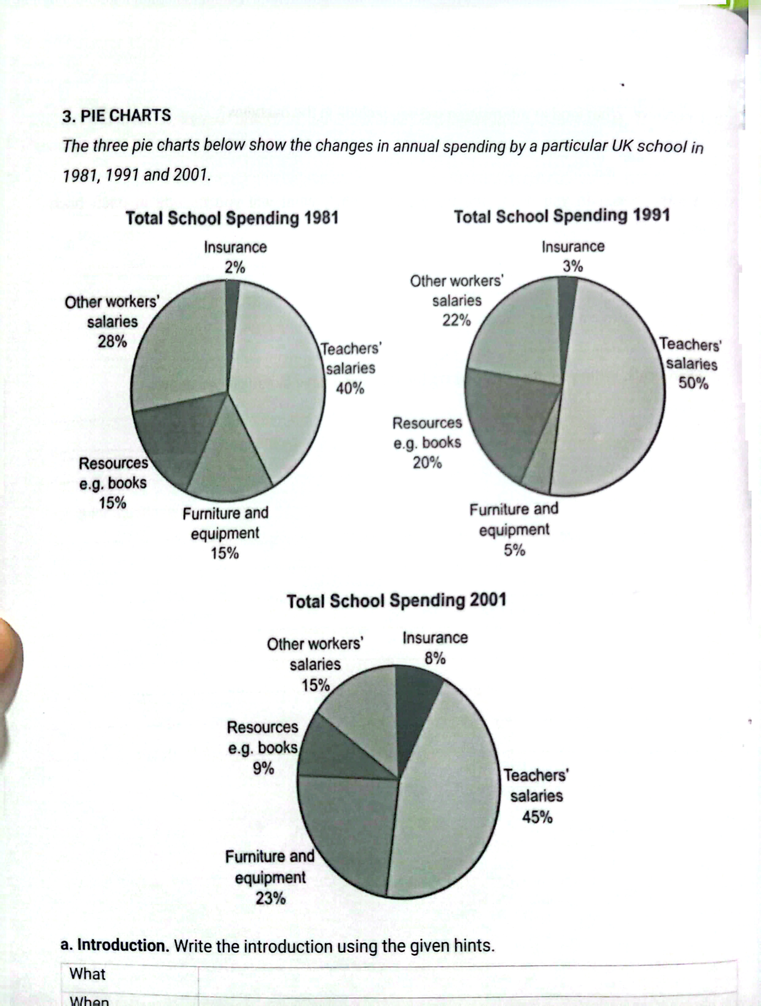
The given pie graphs illustrate how a certain UK school allocated its yearly expenditure across 5 distinct categories in 1981, 1991 and 2001. In general, it is clear that while most of the money was devoted to teachers' salaries, the opposite was true for insurance. Furthermore, the spending on insurance, teachers’ salaries and furniture and equipment increased over the period, whereas other workers’ salaries and resources such as books decreased. Regarding the categories that generally increased over the period, teacher salaries accounted for the largest proportion of the total school expenditure, rising from 40% in 1981 to 50% in 1991 and finished at 45% in 2001. Similarly, the expenses for furniture and equipment started off at 15% in 1981 and then plummeted to 5% 10 years later, before recovering back to 23% in 2001. As for insurance, the school spending on it grew gradually over the 30 year period, from 2% to 8%. Turning to the categories that generally decreased over the period, while the expenditure on other workers salaries trend was a gradual drop after 30 years, from 28% down to 15%, a fluctuation was witnessed in the other resources, from 15% in 1981 to 20% in 1991 and then ultimately finishing at 9%
নমুনা বিস্তারিত
The charts below show the proportion of total school spending in a particular UK school in 1981, 1991 and 2001.
21/07/2026 04:52 7.0 স্কোর
টপিক বা বিষয়
The charts below show the proportion of total school spending in a particular UK school in 1981, 1991 and 2001.
শব্দ সংখ্যা: 205
চার্ট/গ্রাফ
Essay
সামগ্রিক স্কোর
7.0±0.5
ভালো
রাইটিং মানদণ্ড স্কোর
TA7.0
CC7.0
LR7.0
GRA7.0
উন্নতির জন্য বিস্তারিত পরামর্শ দেখতে প্রবন্ধের হাইলাইট করা যেকোনো লেখায় ক্লিক করুন।
গভীর বিশ্লেষণ
Task 1 - Academic Writing
4 tools available
নমুনা রচনা - IELTS Writing Task 1
কোনো নমুনা রচনা নেই
টাস্ক ১-এর জন্য উচ্চমানের নমুনা রচনা বিশ্লেষণ এবং তৈরি করতে নিচের বাটনে ক্লিক করুন।