
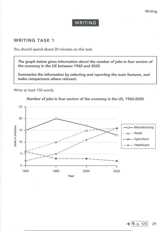
The line graph shows the amount of money from manufacting, retail, agriculture, healthcare in the US from 1960 to 2020. Overall, the number of retail and healthcare upward trends while manufacturing and agriculture decreased. It also shows retail and healthcare was highest period. In 1960, the figure of retail and healthcare increased sharply then it increased gradually from 1980 to 2020. In 1980 saw a slight growth to 10 million in retail, followed by a dramatical rise to 15 million in 2000. Next, the figure of healthcare also increased considerably from 3 million to 11 million between 1960 and 2000. Both retail and healthcare achieved to approxiate 16 million in 2020. The figure of manufacturing increased dramatically to 20 million in 1960, before decreasing slowly to approxiate 17 million in 1980. In addition, there was a sharp fall in manufacturing between 2000 and 2020. Regarding to agriculture, it dropped considerably with 4 million in 1980, followed by a sharp decline in 2000 and 2020.
Detail Sampel
the graph below gives information about the number of jobs in four sectors of the economy in the US between 1960 and 2020. Summarise the information by selecting and reporting the main features, and make comparisons where relevant.
21/07/2026 07:07 5.0 skor
Topik
the graph below gives information about the number of jobs in four sectors of the economy in the US between 1960 and 2020. Summarise the information by selecting and reporting the main features, and make comparisons where relevant.
Jumlah kata: 164
Grafik/Diagram
Essay
Skor Keseluruhan
5.0±0.5
Dasar
Skor Kriteria Writing
TA5.0
CC6.0
LR5.0
GRA5.0
Klik teks yang ditandai di esai untuk melihat saran detail untuk peningkatan.
Analisis mendalam
Task 1 - Academic Writing
4 tools available
Esai contoh - IELTS Writing Task 1
Belum ada esai contoh
Silakan klik tombol di bawah untuk menganalisis dan membuat esai contoh berkualitas tinggi untuk Task 1.