
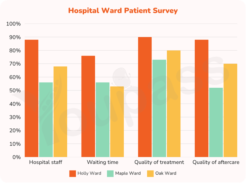
The provided bar chart illustrates the proportion of the patients responded 'very good' about various aspects of their hospital experience across three different wards of a hospital. Upon examining the data, it is noticeable that Holly Ward consistently recorded higher figures than the other wards across all categories. Notably, Maple Ward accounted for the smallest share across most categories, with waiting time standing out the sole exception in which Maple Ward exceeded Oak Ward. Additionally, there was a considerable discrepancy across most categories. To begin with, the Holly Ward represented the largest share in quality of treatment, with a share of 90%. This is followed by the Oak Ward and the Maple Ward, with the former accounting for roughly 56% and the latter representing almost 70%. Turning to the waiting time category, the figure for Holly Ward formed approximately 76%, compared to only approximately 56% in Maple Ward. At the end of the spectrum, Oak Ward made up a minimal share, constituting well over 50%. Regarding the hospital staff aspects, the Holly Ward was the dominant category, with a percentage of nearly 90%, followed by the Oak Ward, with a proportion of approximately 56%. Turning to the remaining aspect, the Holly Ward was in the leading position, standing at almost 90%. Coming in the second and last place were Oak Ward and Maple Ward, making up 70% and 50%, respectively.
รายละเอียดตัวอย่าง
The graph below shows the result of a survey of patients who stayed in three different wards of a hospital. It shows what percentage of the patients replied 'very good' about various aspects of their hospital experience. Summarize the information by selecting and reporting the main features, and make comparisons wherever relevant.
21/07/2026 10:04 6.0 คะแนน
หัวข้อ
The graph below shows the result of a survey of patients who stayed in three different wards of a hospital. It shows what percentage of the patients replied 'very good' about various aspects of their hospital experience. Summarize the information by selecting and reporting the main features, and make comparisons wherever relevant.
จำนวนคำ: 230
แผนภูมิ/กราฟ
Essay
คะแนนรวม
6.0±0.5
ดีพอใช้
คะแนนเกณฑ์การเขียน
TA5.0
CC6.0
LR7.0
GRA6.0
คลิกข้อความที่ไฮไลต์ในเรียงความเพื่อดูคำแนะนำรายละเอียดเพื่อพัฒนา
การวิเคราะห์เชิงลึก
Task 1 - Academic Writing
4 tools available
บทความตัวอย่าง - IELTS Writing Task 1
ยังไม่มีบทความตัวอย่าง
กดปุ่มด้านล่างเพื่อวิเคราะห์และสร้างบทความตัวอย่างคุณภาพสูงสำหรับ Task 1