
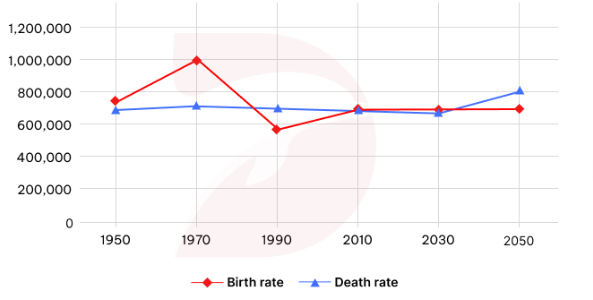
The given line graph illustrates the total number of people who born and died in a European country between 1950 and 2010. There are also a prediction for both from 2030 to 2050. It is clear that the figure for people born in that European country had a big fluctuation. It not only recorded the highest number of people but also hit the lowest point. While the death rate remained relatively stable. Between 1950 and 2010, the birth rate had a bigger fluctuation than the dead rate. In 1950, The numbers for both are practically the same, at nearly 700,000 people. Then, the numbers of people who born in 1970 increased significantly, while the people who died at the same year just rose up a little bit. In that year, the birth rate also reached the peak at 1,000,000 people before it hit the lowest point in 1990. In 1990, the babies was born decreased by half compared to 1970. And the quantity of both sat at the same point, about 700,000 people in 2010. Then in 2030, the number of births and deaths are projected to remain stable. And in 2050, the number of deaths was predicted to rise up to 800,000. while the number of births was projected to remain unchanged, roughing staying at 700,000 people.
รายละเอียดตัวอย่าง
The graph below shows the total births and the deaths in a European country from 1950 to 2050. Summarise the information by selecting and reporting the main features and give comparisons where relevant
21/07/2026 10:04 6.0 คะแนน
หัวข้อ
The graph below shows the total births and the deaths in a European country from 1950 to 2050. Summarise the information by selecting and reporting the main features and give comparisons where relevant
จำนวนคำ: 218
แผนภูมิ/กราฟ
Essay
คะแนนรวม
6.0±0.5
ดีพอใช้
คะแนนเกณฑ์การเขียน
TA6.0
CC6.0
LR6.0
GRA6.0
คลิกข้อความที่ไฮไลต์ในเรียงความเพื่อดูคำแนะนำรายละเอียดเพื่อพัฒนา
การวิเคราะห์เชิงลึก
Task 1 - Academic Writing
4 tools available
บทความตัวอย่าง - IELTS Writing Task 1
ยังไม่มีบทความตัวอย่าง
กดปุ่มด้านล่างเพื่อวิเคราะห์และสร้างบทความตัวอย่างคุณภาพสูงสำหรับ Task 1