
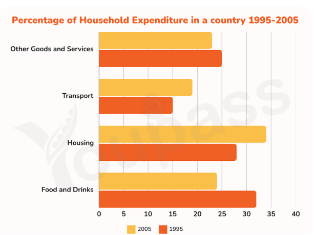
The bar chart illustrates the proportion of four household expenditure on goods and services in one country between 1995 and 2005. measure in percentage. Overall, the percentage of housing was the largest figure throughout the long period, while those for transport was accounted for the smallest amount. Additionally, food and drinks witnessed a significant increase over the 10-year period. In 1995, the proportion of food and drinks was the highest figure, with 32%, which was followed by the figure for housing with only 5% less. Those for other goods and services accounted for 25% which was 10% higher than the percentage of transport. In 2005, while the figure for food and drinks had seen a noticeable decline from 32% to 28%, those for housing experienced a dramatic climb of 7%, which made it became the largest proportion at the end of the period. Besides that, the percentage of transport, which rose slightly from 15% in 1995 to approximately 19% in 2005, but it also remained the lowest figure among four household expenditure. In contrast, the proportion of other goods and services witnessed a modest decrease of only 2% throughout the period.
Sample Detail
The chart shows the percentage of household expenditure on goods and services in a country from 1995 to 2005. Summarise the information by selecting and reporting the main features and make comparisons where relevant.
21/07/2026 10:19 5.5 points
Topic
The chart shows the percentage of household expenditure on goods and services in a country from 1995 to 2005. Summarise the information by selecting and reporting the main features and make comparisons where relevant.
Word count: 191
Chart/Graph
Essay
Overall Scores
5.5±0.5
Basic
Writing Criteria Scores
TA5.0
CC6.0
LR6.0
GRA6.0
Click on any highlighted text in the essay to view detailed suggestions for improvement.
Deep Analysis
Task 1 - Academic Writing
4 tools available
Sample Essay - IELTS Writing Task 1
No sample essay
Click the button below to analyze and generate a high-quality sample essay for Task 1.