
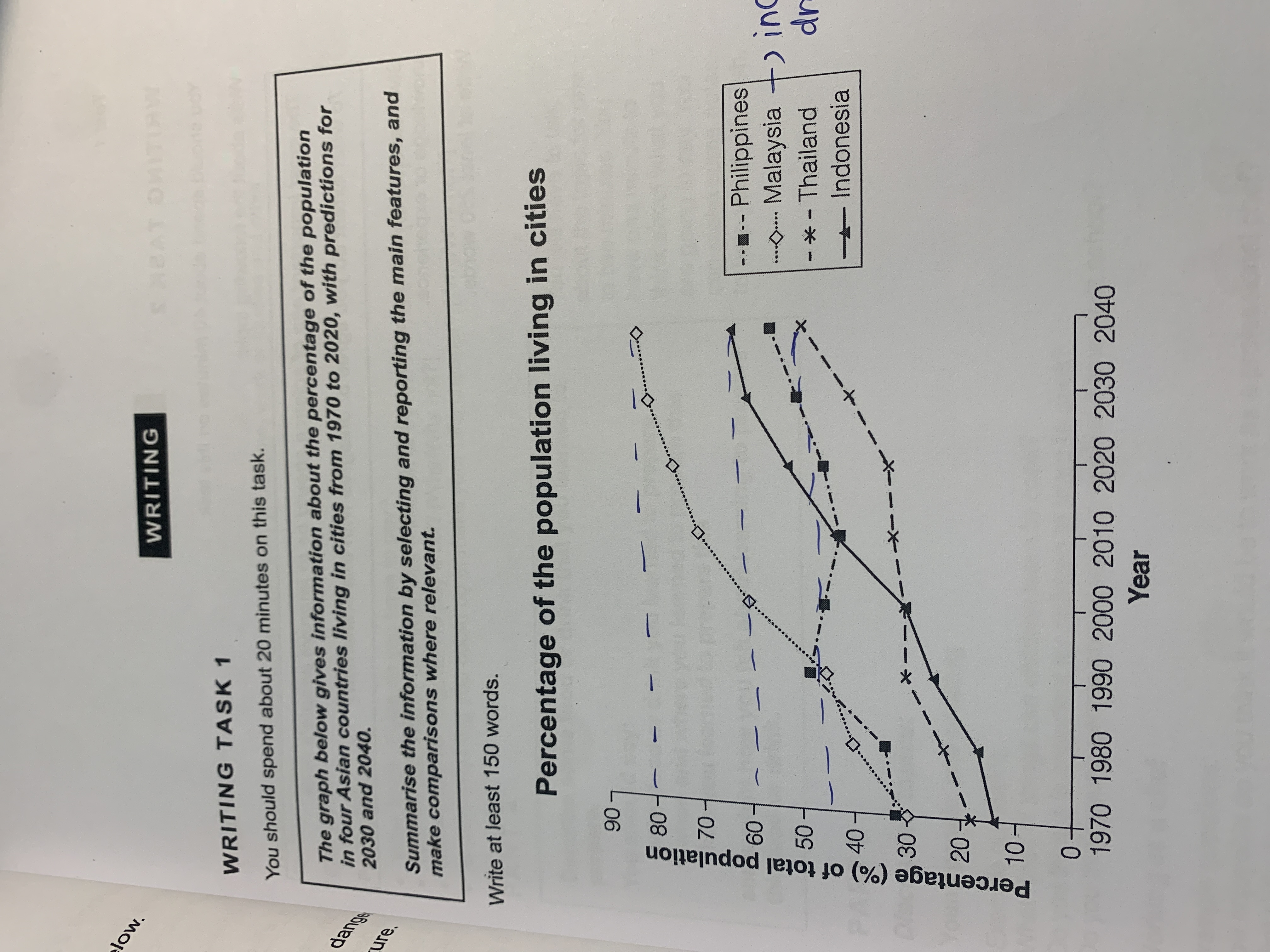
The line graph traces the evolution of four Asian counties living in cuties over time, spanning from 1970 to 2040. Overall, it is clear that the percentage of all four nations increased by the end of period. Throughout 70 year, Malaysia increased dramatically from 30% to 80%, while Indonesia also experienced a significant increase from 15% to 60%. Thailand increased slightly from 19% to 45% within a whole decade. Philippines fluctuated slightly over the period, changing from 31% to 50%. The line graph provides a comprehensive overview of the temporal evolution of the population living in cities revealing both community and changes in it's trajectory.
Sample Detail
The graph below gives information about the percentage of the population in four Asian countries living in cities from 1970 to 2020, with predictions for 2030 and 2040.
21/07/2026 10:45 5.0 points
Topic
The graph below gives information about the percentage of the population in four Asian countries living in cities from 1970 to 2020, with predictions for 2030 and 2040.
Word count: 105
Chart/Graph
Essay
Overall Scores
5.0±0.5
Basic
Writing Criteria Scores
TA5.0
CC5.0
LR5.0
GRA5.0
Click on any highlighted text in the essay to view detailed suggestions for improvement.
Deep Analysis
Task 1 - Academic Writing
4 tools available
Sample Essay - IELTS Writing Task 1
No sample essay
Click the button below to analyze and generate a high-quality sample essay for Task 1.