
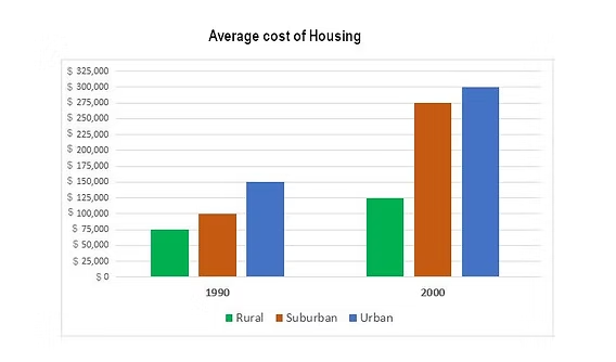
The bar chart compares the average price of housing in three distinct regions namely rural, suburban, and urban, between 1990 and 2000, measured in dollars. Overall, the average cost of housing in three areas had an upward trend after 10 years. Therein, the urban housing was the highest, followed by that figure for suburban area and the housing price in rural hit the lowest point during the period. In 1990, countryside had the cheapest price of housing recorded about 75,000, which was half that figure for city. Besides, the houses in suburban area were more expensive than those in rural and ranked second at 100,000. However, in 2000, the housing cost in all areas also increased. City continued to remain the most costly housing compared with the rest areas stood at 300,000, doube its 1990 figure. Despite having the highest price, the growth of urban housing was not the quickest. Suburban housing experienced the largest increase accounted for 275,000 was approximately three times the figure for that in 1990. While the figure for outskirt and city climbed significantly, the remaining region just had a moderate rise. The houses in countryside was just 50,000 higher after 10 years and was the least growth.
Detail Sampel
the graph below shows the average cost of housing in three different areas
21/07/2026 11:06 6.5 skor
Topik
the graph below shows the average cost of housing in three different areas
Jumlah kata: 202
Grafik/Diagram
Essay
Skor Keseluruhan
6.5±0.5
Cukup
Skor Kriteria Writing
TA7.0
CC7.0
LR6.0
GRA6.0
Klik teks yang ditandai di esai untuk melihat saran detail untuk peningkatan.
Analisis mendalam
Task 1 - Academic Writing
4 tools available
Esai contoh - IELTS Writing Task 1
Belum ada esai contoh
Silakan klik tombol di bawah untuk menganalisis dan membuat esai contoh berkualitas tinggi untuk Task 1.