
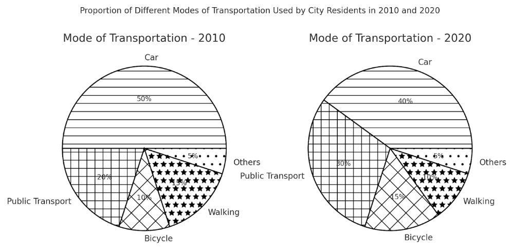
The pie charts illustrate the proportion of different modes of transportation used by city residents in 2010 and 2020. Overall, car usage volume remained relatively dominant over the period, whereas others was the minor category. Bicycle, walking, and others saw slightly fluctuated. It is evidence that the percentage of citizens using car and walking experienced a downward trend over the period. In 2010, car recorded a largest number of users accounted for 50% and decreased slightly to 40% after 10 years. Pedestrian registered an average number at 15% and dropped slightly by 5% over the ten-year period. In contrast, public transport, bicycle and others exhibit a development. Public transports ranked second in two pie charts at 20% and rose gradually to 30% in 2020. Followed by bicycle at 10% in 2010 and grew up to 15%, surpassing the pedestrian data. In addition, unspecified mode of transportation remained the smallest contributor, at 5%, respectively.
Detail Sampel
The charts show the proportion of different modes of transportation used by city residents in 2010 and 2020.Summarise the information by selecting and reporting the main features, and make comparisons where relevant.
21/07/2026 15:33 7.0 skor
Topik
The charts show the proportion of different modes of transportation used by city residents in 2010 and 2020.Summarise the information by selecting and reporting the main features, and make comparisons where relevant.
Jumlah kata: 153
Grafik/Diagram
Essay
Skor Keseluruhan
7.0±0.5
Baik
Skor Kriteria Writing
TA7.0
CC7.0
LR7.0
GRA7.0
Klik teks yang ditandai di esai untuk melihat saran detail untuk peningkatan.
Analisis mendalam
Task 1 - Academic Writing
4 tools available
Esai contoh - IELTS Writing Task 1
Belum ada esai contoh
Silakan klik tombol di bawah untuk menganalisis dan membuat esai contoh berkualitas tinggi untuk Task 1.