
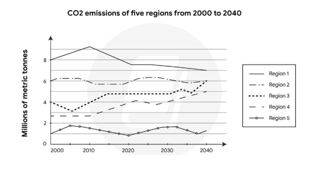
The graph compares the level of carbon dioxide emission across five different regions in the past decades with predicted figures until 2040. It is clear that region 1 has an overall largest volume of carbon dioxide released into the atmosphere, even though it is foretell to be falling steadily throughout the period shown. In contrast, carbon emission amounts in regions 3 and 4 are predicted to increase gradually which illustrate a complete opposite trend compared to the first area. A similarity feature in the other two regions - 2 and 5 are also recognized. Both areas’ carbon emission levels remained stable before 2020 and are being forecast to plateau until 2040. Region 5 is by far the best air quality area with having approximately 1 millions metric tonnes at the end of 2020. By the year of 2040, region 3 is estimated to reach the same level of carbon dioxide production as region 2. This may be the highest jump from 4 to 6 millions metric tonnes of carbon dioxide emission ever recorded in the span of 40 years compared with four other regions.
Detail Sampel
The graph below shows the CO2 emissions of five regions from 2000 to 2020, and predictions up to the year 2040. Provide an overview of the information by identifying and describing the key details, and include comparisons where appropriate.
21/07/2026 15:35 6.5 skor
Topik
The graph below shows the CO2 emissions of five regions from 2000 to 2020, and predictions up to the year 2040. Provide an overview of the information by identifying and describing the key details, and include comparisons where appropriate.
Jumlah kata: 184
Grafik/Diagram
Essay
Skor Keseluruhan
6.5±0.5
Cukup
Skor Kriteria Writing
TA7.0
CC7.0
LR6.0
GRA6.0
Klik teks yang ditandai di esai untuk melihat saran detail untuk peningkatan.
Analisis mendalam
Task 1 - Academic Writing
4 tools available
Esai contoh - IELTS Writing Task 1
Belum ada esai contoh
Silakan klik tombol di bawah untuk menganalisis dan membuat esai contoh berkualitas tinggi untuk Task 1.