
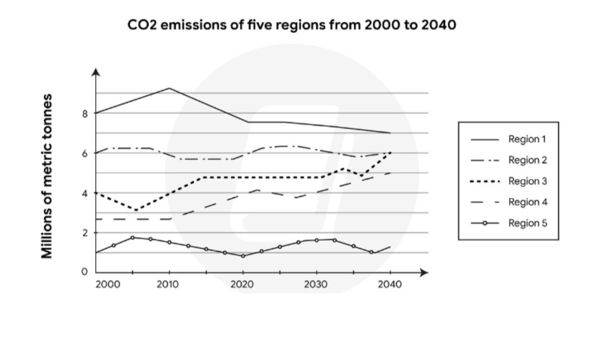
The graph compares the level of carbon dioxide emission across five different regions in the past decades with predicted figures until 2040. It is clear that region 1 has an overall largest volume of carbon dioxide released into the atmosphere, even though it is foretell to be falling steadily throughout the period shown. In contrast, carbon emission amounts in regions 3 and 4 are predicted to increase gradually which illustrate a complete opposite trend compared to the first area. A similarity feature in the other two regions - 2 and 5 are also recognized. Both areas’ carbon emission levels remained stable before 2020 and are being forecast to plateau until 2040. Region 5 is by far the best air quality area with having approximately 1 millions metric tonnes at the end of 2020. By the year of 2040, region 3 is estimated to reach the same level of carbon dioxide production as region 2. This may be the highest jump from 4 to 6 millions metric tonnes of carbon dioxide emission ever recorded in the span of 40 years compared with four other regions.
รายละเอียดตัวอย่าง
The graph below shows the CO2 emissions of five regions from 2000 to 2020, and predictions up to the year 2040. Provide an overview of the information by identifying and describing the key details, and include comparisons where appropriate.
21/07/2026 15:35 6.5 คะแนน
หัวข้อ
The graph below shows the CO2 emissions of five regions from 2000 to 2020, and predictions up to the year 2040. Provide an overview of the information by identifying and describing the key details, and include comparisons where appropriate.
จำนวนคำ: 184
แผนภูมิ/กราฟ
Essay
คะแนนรวม
6.5±0.5
ดีพอใช้
คะแนนเกณฑ์การเขียน
TA7.0
CC7.0
LR6.0
GRA6.0
คลิกข้อความที่ไฮไลต์ในเรียงความเพื่อดูคำแนะนำรายละเอียดเพื่อพัฒนา
การวิเคราะห์เชิงลึก
Task 1 - Academic Writing
4 tools available
บทความตัวอย่าง - IELTS Writing Task 1
ยังไม่มีบทความตัวอย่าง
กดปุ่มด้านล่างเพื่อวิเคราะห์และสร้างบทความตัวอย่างคุณภาพสูงสำหรับ Task 1