
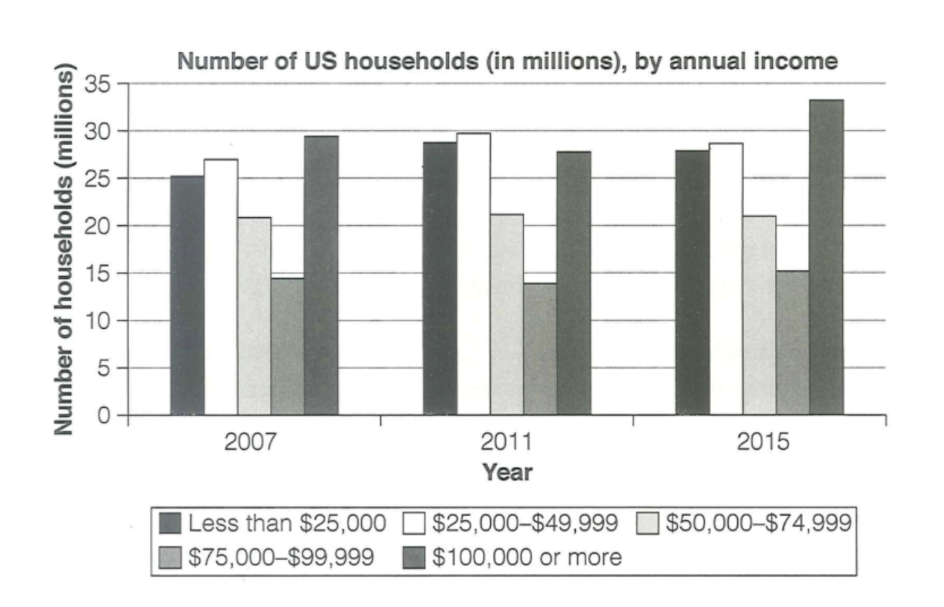
The chart illustrates the number of households in the US by how much they earn yearly in 2007, 2011 and 2015. Overall, households that earned less than $99,999 saw an increase in 2011 but declined slightly in 2015, while households earning above $100,000 experienced a small reduction in number in 2011 but rose dramatically in 2015. Households that earned $50,000–$99,999 remained unchanged in 2011 and 2015. The number of households that earned less than $25,000 and $25,000–$49,999 increased significantly in 2011, making both of them surpass the above $100,000 households, with the $25,000–$49,999 group becoming the largest category. However, the small reduction in 2015 made they lose their leading position but still remained the second and third largest category at 29 millions and 28 millions respectively. In contrast, households earning above $100,000 annually declined slightly in 2011. As a result, this category fell slightly behind households that earned $49,999 or less while still larger than $50,000–$99,999 households. Nevertheless, the massive boost in 2015 made households earning $100,000 or above reclaim their dominance in number at about 33 millions. Interestingly, households that earned $50,000–$74,999 and $75,000–$99,999 remained constant at about 21 millions and 14 millions respectively.
নমুনা বিস্তারিত
The chart below shows the number of households in the US by their annual income in 2007, 2011 and 2015.
21/07/2026 15:51 7.0 স্কোর
টপিক বা বিষয়
The chart below shows the number of households in the US by their annual income in 2007, 2011 and 2015.
শব্দ সংখ্যা: 195
চার্ট/গ্রাফ
Essay
সামগ্রিক স্কোর
7.0±0.5
ভালো
রাইটিং মানদণ্ড স্কোর
TA7.0
CC7.0
LR7.0
GRA7.0
উন্নতির জন্য বিস্তারিত পরামর্শ দেখতে প্রবন্ধের হাইলাইট করা যেকোনো লেখায় ক্লিক করুন।
গভীর বিশ্লেষণ
Task 1 - Academic Writing
4 tools available
নমুনা রচনা - IELTS Writing Task 1
কোনো নমুনা রচনা নেই
টাস্ক ১-এর জন্য উচ্চমানের নমুনা রচনা বিশ্লেষণ এবং তৈরি করতে নিচের বাটনে ক্লিক করুন।