
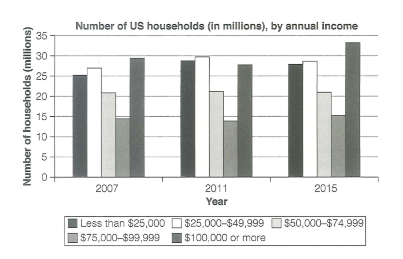
The chart illustrates the amount of households in the US by their annual salary in three different years: 2007, 2011 and 2015. Overall, the number of households with more than $100,000 were recorded as the highest proportion of all at the end of period. By contrast, those with $75,000 to $99,999 remained the lowest figure throughout the period. Regarding the most common categories, although having a slightly decrease in 2011, the number of households with $100,000 salary and more remained at the first place of the chart. In addition, households with under $25,000 income and $25,000 to $49,999 income are likely to experienced a slightly increase over years, which never got below 25 millions. In contrast, households with $50,000 to $74,999 are seem to be the lowest figure of all time. According to the chart, the figure witnessed an unsignificant growth, which still claimed it to be the least popular one. As for year that remained the same over the period, the number of households with $75,000 to $99,999 stayed stable at a humble 20 million.
รายละเอียดตัวอย่าง
The chart below shows the number of households in the US by their annual income in 2007, 2011 and 2015.
21/07/2026 16:14 5.5 คะแนน
หัวข้อ
The chart below shows the number of households in the US by their annual income in 2007, 2011 and 2015.
จำนวนคำ: 176
แผนภูมิ/กราฟ
Essay
คะแนนรวม
5.5±0.5
พื้นฐาน
คะแนนเกณฑ์การเขียน
TA5.0
CC6.0
LR6.0
GRA6.0
คลิกข้อความที่ไฮไลต์ในเรียงความเพื่อดูคำแนะนำรายละเอียดเพื่อพัฒนา
การวิเคราะห์เชิงลึก
Task 1 - Academic Writing
4 tools available
บทความตัวอย่าง - IELTS Writing Task 1
ยังไม่มีบทความตัวอย่าง
กดปุ่มด้านล่างเพื่อวิเคราะห์และสร้างบทความตัวอย่างคุณภาพสูงสำหรับ Task 1