
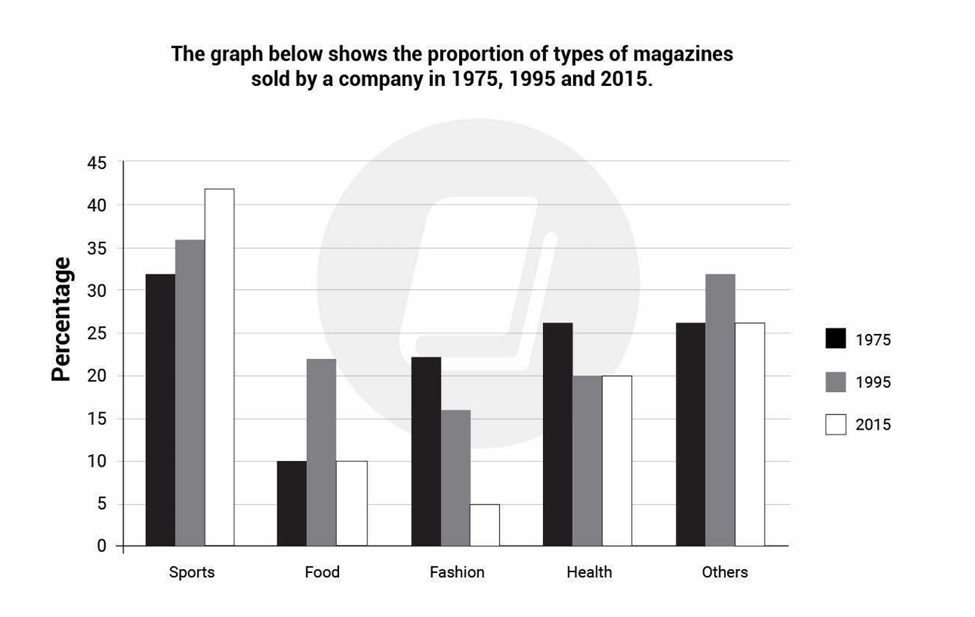
The bar graph illustrate the proportion of types of magazines sold by the company in three distinct years 1975, 1995 and 2015. Overall, each category had different trend over the given period. It is also noticeable that sports recorded the highest percentage in three years. Looking at the details, sports witnessed a gradual rise over a 3-year period, starting at around 32% in 1975. After 20 years, sports proportion met over 35% in 1979 and reached its peak at 2015 with approximately 42%. In stark contrast, food figure experienced some variations, with 10% at the beginning and 22% in 1995 before dropping to 10% in 2015. Others category possessed the same trend, which started at roughly 26% in 1975 and raised to 32% in 1995 before dipping to 26% in the last year. Turning to the remaining categories, health experienced a steady decline from around 26% in 1975 to 20% in 1995 before plateauing out at this level for the rest of the period. In the last category, fashion recorded the highest level in 1975 at 26%, falling to 20% in 1995 and 5% in 2015.
รายละเอียดตัวอย่าง
The graph below shows the proportion of types of magazines sold by the company in 1975, 1995 and 2015.
21/07/2026 16:19 7.0 คะแนน
หัวข้อ
The graph below shows the proportion of types of magazines sold by the company in 1975, 1995 and 2015.
จำนวนคำ: 186
แผนภูมิ/กราฟ
Essay
คะแนนรวม
7.0±0.5
ดีมาก
คะแนนเกณฑ์การเขียน
TA7.0
CC7.0
LR7.0
GRA7.0
คลิกข้อความที่ไฮไลต์ในเรียงความเพื่อดูคำแนะนำรายละเอียดเพื่อพัฒนา
การวิเคราะห์เชิงลึก
Task 1 - Academic Writing
4 tools available
บทความตัวอย่าง - IELTS Writing Task 1
ยังไม่มีบทความตัวอย่าง
กดปุ่มด้านล่างเพื่อวิเคราะห์และสร้างบทความตัวอย่างคุณภาพสูงสำหรับ Task 1