
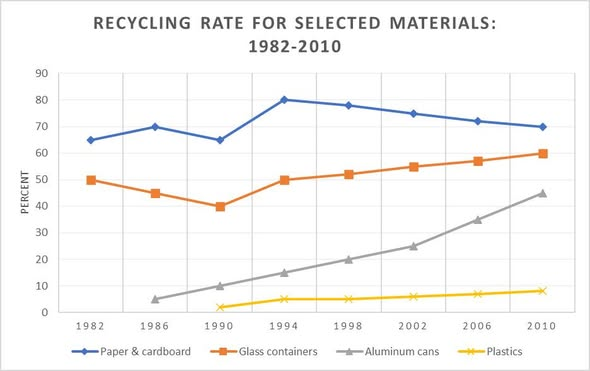
The chart below gives information about the recycling rates for four selected materials over the course of 28 years from 1982 to 2010 in a particular country. Overall, it can be seen that most the percentages of materials rose from 1994 to 2010, with the exception of the rate of paper & cardboard. The percentage of paper & cardboard was the highest proportion of all materials during the 1982-2010 period. The proportions of paper & cardboard and glass containers experienced a fluctuation from 1982 to 1994. The rates of paper & cardboard and glass containers hit a low of roughly 65% and 40%, respectively. During the period from 1994 to 2010, the percentage of paper & cardboard declined from 80% to 70%. However, that of glass containers increased from 50% to 60%. In 1982, there was no the statistics on aluminum cans and plastics. From 1986 to 2010, the rate of aluminum cans rose significantly, reaching a peak of under 50% at the end whereas that of plastics began to increase marginally since 1990, to just under 10%, which was the lowest proportion of all materials
รายละเอียดตัวอย่าง
The graph below shows the proportion of four different materials that were recycled from 1982 to 2010 in a particular country
21/07/2026 16:28 6.5 คะแนน
หัวข้อ
The graph below shows the proportion of four different materials that were recycled from 1982 to 2010 in a particular country
จำนวนคำ: 186
แผนภูมิ/กราฟ
Essay
คะแนนรวม
6.5±0.5
ดีพอใช้
คะแนนเกณฑ์การเขียน
TA7.0
CC7.0
LR6.0
GRA6.0
คลิกข้อความที่ไฮไลต์ในเรียงความเพื่อดูคำแนะนำรายละเอียดเพื่อพัฒนา
การวิเคราะห์เชิงลึก
Task 1 - Academic Writing
4 tools available
บทความตัวอย่าง - IELTS Writing Task 1
ยังไม่มีบทความตัวอย่าง
กดปุ่มด้านล่างเพื่อวิเคราะห์และสร้างบทความตัวอย่างคุณภาพสูงสำหรับ Task 1