
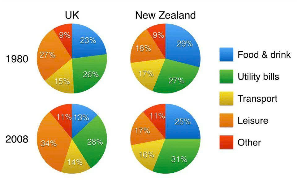
The pie chart illustrates the percentage of spending on various goods and services of households in the UK and in New Zealand in 1980 and 2008. Overall, the figure of food and drink saw a significant decrease, while other expenses experienced a growth in two countries in 1980 and 2008. However, leisure was the only category that witnessed an upward trend in the UK but a downward trend in New Zealand. In 1980, the proportion of the household expenditures on leisure accounted for the largest in the UK at over a quarter. Then this figure went up, peaking at over a third in 2008. Nevertheless, the percentage of New Zealanders spending on leisure took up 18% in the first period and declined minimally at 17% over 28 years. An opposite allocation can be seen in other goods and services which had an identical growth, from 9% to 11%. The figure of food and drink recorded the highest proportion of spending in New Zealand at nearly 30% and in the UK consisted of 23% in 1980. After that both countries fell to a quarter and over a tenth respectively in 2008. While utility bills in two countries decreased minimally at approximately 3%, transport increased slightly at approximately 1% during 28 years.
รายละเอียดตัวอย่าง
the percentage of spending on various goods and services of household in the UK and in the New Zealand in 1980 and 2008
21/07/2026 17:16 5.5 คะแนน
หัวข้อ
the percentage of spending on various goods and services of household in the UK and in the New Zealand in 1980 and 2008
จำนวนคำ: 210
แผนภูมิ/กราฟ
Essay
คะแนนรวม
5.5±0.5
พื้นฐาน
คะแนนเกณฑ์การเขียน
TA5.0
CC6.0
LR6.0
GRA6.0
คลิกข้อความที่ไฮไลต์ในเรียงความเพื่อดูคำแนะนำรายละเอียดเพื่อพัฒนา
การวิเคราะห์เชิงลึก
Task 1 - Academic Writing
4 tools available
บทความตัวอย่าง - IELTS Writing Task 1
ยังไม่มีบทความตัวอย่าง
กดปุ่มด้านล่างเพื่อวิเคราะห์และสร้างบทความตัวอย่างคุณภาพสูงสำหรับ Task 1