
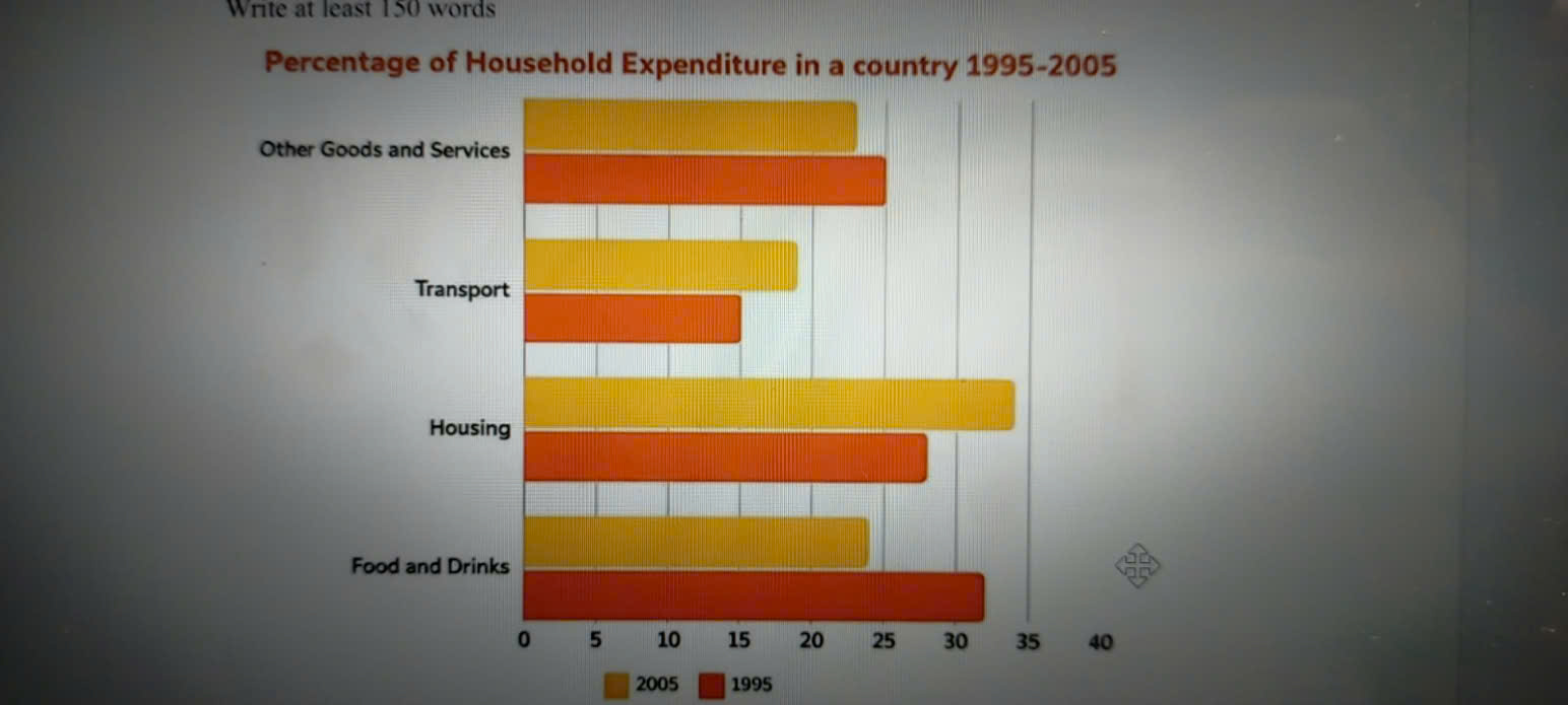
The chart illustrates the percentage of household expenditure on goods and services in a country between 1995 and 2005. Overall, the percentage of food and drinks was the highest in 1995. More than 10 years later, the percentage of housing achieved the highest value. Besides, the percentage of transport remained the lowest among the four groups. The percentage of other goods and services showed a downward trend from 1995 to 2005. Looking at the details, the percentage of food and drinks reaching peak levels was approximately 32% in 1995 and after 10 years, its rate had decreased to 24%. Additionally, the percentage of housing reached approximately 27% in 1995 after its rate peaked at about 34% in the period. Turning to the second half of the period, the percentage of transport slightly increased from 15% to 19% in a decade. Moreover, the percentage of other goods and services entering and leaving the destination is higher than that of transport and slightly decreased from 25% down to 23%.
รายละเอียดตัวอย่าง
The chart shows the percentage of household expenditure on goods and services in a country from 1995 to 2005. Summarise the information by selecting and reporting the main features and make comparisons where relevant.
21/07/2026 18:06 6.5 คะแนน
หัวข้อ
The chart shows the percentage of household expenditure on goods and services in a country from 1995 to 2005. Summarise the information by selecting and reporting the main features and make comparisons where relevant.
จำนวนคำ: 167
แผนภูมิ/กราฟ
Essay
คะแนนรวม
6.5±0.5
ดีพอใช้
คะแนนเกณฑ์การเขียน
TA6.0
CC7.0
LR6.0
GRA7.0
คลิกข้อความที่ไฮไลต์ในเรียงความเพื่อดูคำแนะนำรายละเอียดเพื่อพัฒนา
การวิเคราะห์เชิงลึก
Task 1 - Academic Writing
4 tools available
บทความตัวอย่าง - IELTS Writing Task 1
ยังไม่มีบทความตัวอย่าง
กดปุ่มด้านล่างเพื่อวิเคราะห์และสร้างบทความตัวอย่างคุณภาพสูงสำหรับ Task 1